Pages

Tuesday, February 24, 2009

Tivoli – Photographing Laser Light Show & Night Photography


Tivoli is an old style garden and amusement park in the downtown core of Copenhagen Denmark. There are many novel cafés and ethnic restaurants (29). There is even live theatre, mostly Hans Christian Andersen stories, trapeze artists, pantomimes, and ballets and concerts mainly performed during the summer. It is open all year round but I don’t know about hoping on a wild ride while the temperature is around the freezing point.

The park was opened in 1843 by the writer-architect Georg Carstensen (1812–59) on the southern part of the old city. A remnant of the former moat became a lake for boating. It still has a feel from that period.

With Tivoli’s extensive flower gardens, fireworks, coloured floodlights, and illuminated fountains, which all tend to brighten the park at night, I thought this would be a good place to take some night photography in between bouts of pure amusement.

Tivoli sits on a one block site and for those walking on the side of the street you wouldn’t even know that it existed except for the main gates and a couple of times you can see these 200 ft towers sticking up.

f3.5, iso 800 .4 sec, 18mm


I set the ISO to 800 which for the D300 gives very low noise visibility and still allowed to capture most of the shots between 1/30 and 1/50sec which I could hand hold with the added vibration reduction on lens.

The top image, I laid the camera on a fence rail as I needed more than ½ sec to really capture some background detail.

f5.6, 1/30, iso 800 170mm

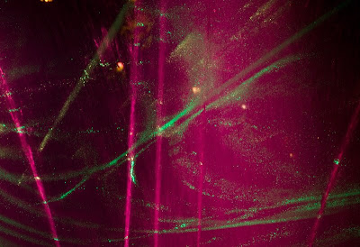
Close-up of central part of light effects. It has almost a curtain like feel and wonderful moving green luminescent patterns.

Thanks to my relatives because they knew the time the laser light show was to start and the best place to position ourselves (on the bridge over the pond) for the best view of the show.

Ten minutes before the start of the show, huge fog guns were filling the pond with huge clouds for the light to strike. We were lucky this night as there was not much wind.

f4.5, 1/30, iso800, 46mm


f4.5, 1/30sec, iso800, 18mm

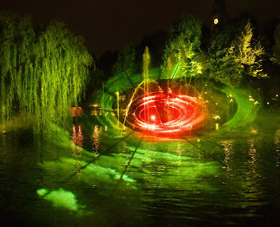
This image is more of a wide angle showing the layers of fog and the lights striking it. I did add the red center as it was all green. I did this by adding a new layer and painted the central part Red and set the blend mode of color. I tried a rainbow circular gradient but it was a bit too outlandish.


f4.8, 1/30sec, iso800, 55mm

The one thing I like about the above image is that on first impression, I thought I shot this upside down. But it is correct. The lights on the water radiate up and now hit the lifting fog bank.


f4.5, 1/40sec, iso800, 18mm

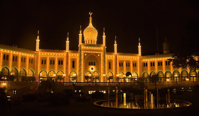
Many of the buildings are gloriously lit at night. In fact, most of the park is one large visual feast.

f4.5, 1/50sec, iso800, 36mm

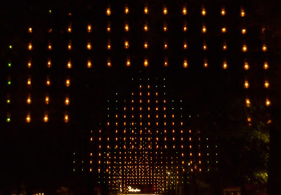
On one side of the park are these giant hanging sheets of lights and the above image was an attempt to capture these with some depth.


f4.5, 1/50sec, iso800, 18mm

At the end of the evening we stepped back out on the normal Copenhagen streets and for one image I was able to capture all the street lights turned green. This scene is in stark contrast to the brightly lit park which is very crowded and now this normal street seems like a surreal world almost Outer Limits in theme.


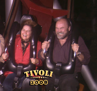
My wife and I did try some of the exiting (scary) rides and while I was able to test one more the 200ft vertical drop, she actually faired better during the course of the ride. The picture below, taken by the amusement park, shows how I was hanging on for my dear life, while she was grinning with excitement. I was enjoying it.


After this ride we went on the H.C. Andersen ride in a chest through his stories. A lot slower and safer on the body!


Niels Henriksen

Tuesday, February 17, 2009

Be Thankful for our Modern Cameras

Today I feel grateful that our modern cameras work so well that from a technical camera point-of-view it is quite simple to take very good images. I am also thankful that I have over the past few years taken a lot of photographs.

You may wonder as to why I am being so thankful. With my artistic endeavours some things work well like photography. With others like the exploration of oil painting, the paint does come out of the tube and when you mix 2 colours you get a new colour but that is as far as those parts that are doing well.

On the weekend I was trying to paint a street scene from one of my photographs and why do I always pick the hard to paint scenes. I hate being a raw beginner again but as far as I know there is no other way to start the journey.


The images in this article were all taken at the Jespherhus Gardens near Nykobing Mors, Denmark.


I darkened some of the green foliage on the top and bottom right to give a bit more emphasis to the lighter branch near the middle.

I have done some watercolour paintings and after awhile some were good enough to frame and sell. With watercolours it is very difficult to correct mistakes and I thought, well with oil paint I just paint over. What could be easier?

Well a lot of things. I was encountering difficulties between the vision of a great painting in my head and what was actually rendered in front of me. I had started this a while ago and wasn’t sure how to proceed next.


This image was fun to play with in Adobe Camera Raw as I adjusted the luminance and saturation sliders to bring out more of the colours.

So I mentally said to myself, “Stop beating yourself up.” Just paint and have fun. Learn from what happened even if it isn’t better than a kindergarten painter. Hey some of those children are good.

That’s what I did. In different parts of the painting I tried different t techniques. Not that these techniques support each other but to experiment and push the colours around.

Close-up of a very large cactus plant leaf.


That’s the fun part loading paint on the brush and pushing the colours around. Almost therapeutic but not great art.

The same learning approach can be applied to the camera. Don’t stress over the fact that your images aren’t hanging in some great gallery.


Have fun. Do try different approaches such as depth of field (DOF), slow or fast motion, various or strange angles. Then when looking at each image try to determine what parts you like best.

For other sections of the image try and figure out why its not working for you as this will give you insight for future shots for those things to avoid.

The back-lit leaf provides a very striking graphic pattern with the light and dark veins.

Once again the reason I am thankful for camera technology and a huge file base is that at times like this, when I don’t have enough time, I can go over some previous photographic events and with reasonable probability find some images that you find interesting.


I liked the Cyan colour tinge on some of the central leaves.

During one afternoon in a flower garden I was able to take a range of different plant compositions and because our cameras are so great now, it was relatively easy to have a few turn out well.

The plant has a very strong golden colour to the leaves and central flower cluster but I just couldn’t seem make it pop. When I converted to B&W the curly stamens now became more interesting.

All that is needed is an eye to see more or deeper than the grand vista. A mind that is inquisitive and willing to examine our perceptions of the everyday world and now just an off-the-counter camera that for the most part will take the great images that you see before you.

There are a few skills and techniques that will help you in modifying a scene through the camera settings when some parts need to be de-emphasised.

I hope that you found at least one image interesting.

Niels Henriksen


Tuesday, February 10, 2009

Web Makes Poor place for Photographs

I was working on set of images from a walk I did about 2 weeks ago to shoot from the top of a large hill, which was the highest point in a radius of 25km. While I was trying to bring out all the fine detail of leafless branches this winter scene it occurred to me that the blog readers will not truly be able to see this detail and therefore may not appreciate the quality of this image. In a large print It is fun to explore the different parts as you scan about the image.

With the other problems I have had with some images being displayed on the web I thought that the web just isn’t that great a place to show your images if you are trying to manage your quality. This is an over simplification as there are many images that do look just fine on the web, but there are still problems.


Fine Detail

The images I display as well as those from many other photographers have been reduced in detail to make them easier to see on a computer monitor. I mostly keep mine to a max width of 800 pixels. Most of the blog readers have resolution 1280 pixels wide or less. There are a few at 1920 px but this seems to be the maximum size. This is a reduction of more than 1/5th in image size.

Any images larger than this resolution will either get compressed by the browser to fit the screen resolution or the viewer will have to scroll around to see all parts of the image. Not the best of solutions. Nothing beats looking at a well-made photograph when printed 16x20 inches in size.

This image was created using 3 Adobe Camera Raw smart layers. The base layer was set to normal default settings, which keeps some of the softness in the treetops. For another layer I increased clarity and the luminance and saturation for the yellow, orange colours and reduced for the cyan and blue channels. I then masked in some parts to give them more visual punch to these parts of the image: the yellow tree branches and the white birches. For the last layer I wanted the distant hills to have more of a cool darker blue tone.

Color Temperature

At first I thought that this was only applicable to monitor White Balance settings, where most people have the monitor set too high in colour temperature, either 7,500 or 9,000K which will tend to make any subtle purple tones almost completely Blue in Hue.

But this also happens with prints where the colour temp of the lights, from Red incandescent, to the blue of bright fluorescents impact the colours. The eyes have the ability to auto correct and therefore it is hard to see a colour cast when viewing a print, but it is still there. If you have ever been in an underground parking and observed the colour on a red car under tungsten (3,200K) lighting, it almost has a muted brown-orange hue, not the bright red you se outside in daylight

It seems that either medium has its own set of colorcast problems. Monitor having too much blue cast and home indoor lighting either too much red (incandescent) or fluorescent ( can be blue or red).


I used 2 B&W layers to create this final image. The first layer I increased the luminance and saturation in ACR for the yellow and green channels and darkened the blue and cyan for the sky. I wanted the green pine needles to go very light when I applied a B&W layer in Photoshop. With the large reduction in Blue channels the sky went to dark near the top and the bottom edge stayed light. By creating another ACR smart layer I could control the sky color better and with its own B&W adjustment layer and then I masked in this sky.


Dot Size

Most monitors these days are LCD types and these have sharp edge contrast to do the construction of the pixels. There are no gradations between LCD pixels, it goes instantly from one color to the next.

Most of the current ink jet printers using a print dot range of 240-360 dpi create images that have ultra fine and subtle tone and edge transitions. I have always enjoyed a printed image over its LCD version even at higher resolutions.


It was an icy cold day and the camera did correctly capture the cold hue in the shadows. There are times where you don’t want WB corrected.


Screen Contrast

By far, this is the one attribute that causes the largest photo alterations. I have 2 sets of double LCD monitors. One is calibrated, the other is only a cheaper type used mainly for pallets and tools. On the cheaper monitor the photos all look drastically different.

I know exactly how my images should look and when I also observe on other monitors, there are drastic tonal changes. Darks becoming brighter and high light tones being almost blown out. Many displays tend to increase the contrast of the image.


Just a slight LAB adjustment to increase color contrast.


Summary

No medium is perfect I on average I find more consistent results from printed images but how do you display your works of art and hopefully convey to someone remotely the quality you intended when they are viewing on questionable display monitors.

I don’t have any answers to solve this but I know when I display in a gallery or art fair at least the viewer and I are looking at the image in the same light.


Niels Henriksen

Like

Related Posts with Thumbnails