Pages

Sunday, May 25, 2008

SoFoBoMo – Book Finished


I have finally finished the SoFoBoMo Book project, at least in PDF form. The composite image below shows what a published book might look like if I ever get around to publishing this photography book.


The creation of a photography book was quite enjoyable project to undertake, even though it did take up a fair bit of time to complete.

I decide to use “OpenOffice.org” as my publishing tool as I found MSword not able to completely remove the margins. Learning a new tool while undertaking a project does have its pitfalls, but luckily after a few hours I was able to get the hang of it. I did find that since the file was 170MB it did become a bit slow while doing editorial changes and a few times I found the image moved around.

A large PDF version of the book found can be accessed by this link (33BM with 75% jpeg compression) as the book was designed to 11.5x8.5 inches. This choice was not based and design criteria, but I selected one of the photography books I had that I though would be a good size and used these dimensions.

A smaller version with more compression can be accessed here . (15MB with 25% jpeg compression). Either way these are large files.


The B&W continuous pano images of the Quebec shoreline, which are along the later pages in the book, are 70,000x500 pxs. This started to become am editing problem in Photoshop and I had to eventually break it into 2 files

Image from book – Muted Ferns

The journey to produce the book took on 2 round trips of 300 kms to visit very good friends at their remote property that cover the rugged area north of Gananoque, Ontario which has lakes and beaver ponds on the land.

I also took 2 photo excursions along the shoreline of the Ottawa River on both the Ontario and Quebec side within the city limits of Ottawa. We are very fortunate that the city planners have made the river access public and have left some places as wilderness areas.

I took a week off work, as holidays, to work on the files and edit the book. I am not sure that I would have gotten it all completed otherwise.

Image from book - Flooded trees along shoreline of the Ottawa River


I would undertake another such project but if you are using nature as the backdrop then the month and season is critical to the theme and availability of images. Maybe next a food project where I can shoot indoors.

As the other bookmakers have stated it is an all consuming project and now that it is over I do feel a bit tied. I wish I had another week to really work on the book design elements, but there is a deadline that I need to meet.

Also there is standing about 10 deep, the outside and other chores that I have neglected as I pursed this passion blindly and they now want their place in the sun.

If its not too big to download, please let me know what you think. As a first book there is always room, maybe too much, for improvement.


Niels Henriksen

Sunday, May 18, 2008

SoFoBoMo – The Fuzzy Month and now Fuzzy Mind


2 weeks ago I mentioned that I had finally locked in on my SoFoBoMo project, this being a special place that I visit regularity, known to a small circle of friends as “The Land”. There was a concern I had that I may not have enough good photos to make the list of 35 needed and it was a good 1 ½ hr drive to go back there again.


I've talked a fair bit about creativity lately and with the concerns I was having. I wasn't about to let the strictness of my own decisions stifle my creativity (or to find a way out of my firm decision). I have therefore decided to 'augment' a fancy word for changing my mind, the theme to include the 'River' in the title to arrive at a new and hopefully better theme 'The Land' and the River. These 2 subjects are separated by more than 150km and the only physical connection is the lakes at the land eventually feed back to the Ottawa River. The spiritual part that invigorates the mind is that both places have water near by and like many others I can just sit an look at the waterscape for hours.


The book design elements is completely new to me and I am having some fun thinking about how to layout the pages, covers and exploring how book design components all come together to form a cohesive entity. The river idea got me thinking about using the far shoreline, which is the province of Quebec, and taking many overlapping images for many miles along the shore to form one giant panoramic image. I would then use this panoramic shoreline as a horizontal continuous bar along the bottom of each page. As you move along from page to page you will also be seeing the far shoreline moving from west to east. I am trying to decide if I should leave the shoreline in full colour or convert to B&W and set to a lower opacity. I am concerned that if it was in full colour it might detract from the book images. As B&W and somewhat see-through it becomes more a like colour strip and a page design element.

I have taken next week off as holidays to work on finishing the book as I just hate the stress of completing things I enjoy when there are constraints imposed such as deadline. Luckily I do have enough vacation days to carry me through the year.

The image below was taken at the Land from a bluff overlooking several connected lakes which are part of the Rideau River system connecting Kingston to Ottawa.

I liked the wildness of the snarly tree branches contrasting with the of tranquility of the distant landscape peering through the opening in the canopy.

This is one of the images I will be using in the book, I guess you get a sneak preview with this. I thought this might make a good image to tie both themes of the land and the river.

The original image from camera Raw is shown below. I found that there was not enough separation between the colours of the foliage in the foreground. The cedars had more orange and the rest of foliage had more green with some yellow and blue.

I therefore decided to accentuate the difference in the orange in the cedars and the remaining foliage. I changed the hue for yellow to more orange, increased the saturation for orange and the luminance a bit to create more separation.

The colour adjustments available with Adobe Camera Raw are simply great as I can individually adjust the hue, saturation and luminance not only for the primary colours but also the secondary. This is a tool I use quite often to play around with the image. There is no set formula as to what works. Normally, I go to the luminance setting and change each of the colours from min to max luminance to watch where the effects occurs. I find this mode provides the best clues to colour changes in the other 2 modes.

The rest of the foliage and in the the far background, which is mainly green with some blue and cyan, I wanted this darker and less saturated. For the hue I moved the cyan slider towards more blue and desaturated the blue colour a bit. I also reduced the luminance for both the cyan and blue to darkened the foliage and background.

Click on image to see sliders in more detail


The Ottawa river is at maximum water height and there are many parts of low shorelines which are flooded at this time of year from all the snow melt in the feeder rivers up north.


This is taken from the Ontario side of the Ottawa River along its flooded shoreline.

I converted to B&W, cropped a bit of the extraneous side detail and then darkened the image to create more mystery about the hole or is it a house for some large strange creature or hobbit?


Niels Henriksen


A Photographer's Adage


When Jack London had his portrait made by the noted San Francisco photographer Arnold Genthe, London began the encounter with effusive praise for the photographic art of his friend and fellow bohemian, Genthe. "you must have a wonderful camera...It must be the best camera in the world...You must show me your camera." Genthe then used his standard studio camera to make what has since become a classic picture of Jack London. When the sitting was finished, Genthe could not contain himself: "I have read your books, Jack, and I think they are important works of art. You must have a wonderful typewriter."


Sunday, May 11, 2008

The Magicians


First, since it is Mother’s Day in Canada and the United States, for all mothers, soon to be mothers and all those who had mothers - a very special thanks to the kind love and warm you gave me.

Do click on any image for a larger version

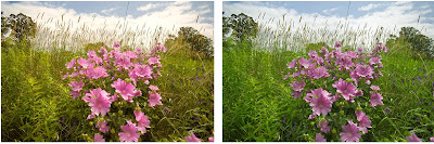
In this weeks article I wanted to take a very ordinary image and see if I could somehow improve the appeal factor. This image was taken out in the back fields were I live and while walking around there was something that struck me as pleasing, watching the large collection of soft light purple flowers moving in the tall grasses on a warm summer’s day afternoon.

Maybe I should have done a video to better capture the feeling I had but that’s not what I do, at least not for now.

The book I used last week was just grabbed off the bookshelf with no thought for title, except that it be an old book. Somehow that title “The Magicians” seems appropriate for this week’s article.

The Magicians I discuss here are a set of standard Photoshop enhancement techniques frequently used to improve people’s images, which implies that if I am not good enough to take an exciting photo, then I can use these wonderful Photoshop techniques to give me that “WOW” factor that I was unable to achieve with my skills.


It’s not that I wanted to just use these techniques, but by looking at the results I thought it might give me some ideas that I had not previously thought of and therefore would allow me to think of new ways to enhance an image.


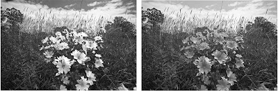
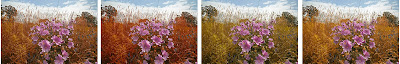
This B&W version is my favourite of all the variations I made. Even though I did find the Nik Filter set to Indian Summer #3 to be quite interesting in changing all the greens, at least in the grass to a soft yellow orange. And at the end of the article you will find one I love for all the fine patterns of grasses in the red-blue wash.


So today I will hold court (sounds pompous, but enjoyable) and let each of the magician perform their tricks and magic and see if any of them can WOW me.
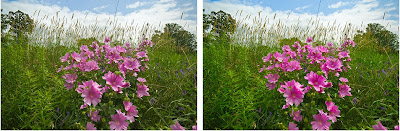

LAB
The first obvious choice is to convert to LAB and increase the A and B channels as this image was somewhat muted and maybe I could find elements that would help the flowers stand out more for the grasses.

The strip shows the results using 5 and10 gridline settings (set to 10 grids) to increase steepness of curves.
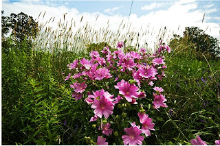
Overlay
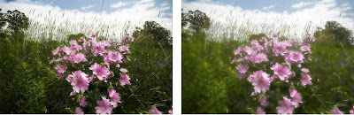
Another easy approach is to duplicate the layer and set the blend mode to overlay. This will normally punch rather drab images. You may need to reduce the opacity a bit if the effect is too strong.


B&W
Colour at times can confuse the image as it can become about the colour patterns and not about the subtle tones and shapes found with these patterns.
The right image is a standard convert to B&W. On the left version I used the sliders to darken the sky, lighten the flowers and darken the grasses.

Nik Filters
There are many Photoshop actions or filters that can produce interesting and quite varied results. I have a collection of NIK filters and I used a few to see the results.

The top row of images are the 4 variants of the autumn filter and the bottom is the sunshine and foliage filters.


Crop
Crop until you find something useful. While good for the web as images are small, I can get 25 different images from the original camera file. Now if a client wanted an 8x10 I just might be in trouble to produce this.

Orton
The Orton effect is originally created by performing a double exposure of the same film image. The first shot is normal with clear and crisp focus. The second image is taken by making the image out-of-focus, blurry yet you can still make out outline shapes.
Many people achieved almost the same effect in Photoshop by duplicating the layer and performing a Gaussian type blur. This is not technically correct as when using a camera to change the focus your are also at the same time changing the field of view and normally every object, now blurred, is actually a little larger.
Therefore, to create the same effect in Photoshop you need to stretch the second layer (transform ctrl-T) to make it slightly larger. This then will give a larger glowing area around the objects. By using the lighten or soft light blend mode to achieve the effect.


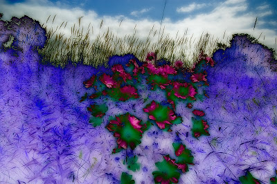
Go Wild - Change Colours
OK! The last-chance-hotel method is to mix the colours up and watch the fireworks.

This was an accident as I inadvertently inverted one of the layers I was working on as it was set to difference blend mode. I printed this image out 8x10 as I just loved those surreal parts with the wild colours.


Summary

I am not sure that whatever method or parts of techniques will ever quite get to the memory I had. That may be ok as the memory may not be real and only a recollection of what I expected to find and actually didn’t.

Is there one approach that works better than others?

It really depends on the feelings and emotions that you want to convey with the image.
For me this was a reflective and quiet spot, just perfect for sitting, looking and contemplating about the wonders around us. Therefore, soft colours and muted tones would best lend to these feelings. Also, in hindsight I probably should not have made these flowers so large and central in proportion to the grasses around me.

They jump out a bit and really should be more of a discovery as you gaze around the scene.

It was also just plain fun to experiment with different colour editions. Akin to a child with a new crayon set and it doesn’t get any cooler than that.


Niels Henriksen

Photographer’s Showcase

Today I want to identify 2 good blogs that I read regularity and both provide a magazine style format with many interesting categories. Both have a great reader membership and occasionally, contests.


All Day I Dream About Photography highlights photographers, research interesting material on the web, collects great images form its Flickr membership and interesting articles.


SduffyPhotgraphyBlog Lately has been showing some interesting photos from his tour in Paris. There is regularly a wide range of articles with good photographs and a review of what’s happening in the photographic world.

Sunday, May 4, 2008

SoFoBoMo "The Land"


I have finally started the Solo Ph(F)otogrpahy Book Month project and in fact I probably started one or two weeks ago. This was in part due to my uncertainty with finding a suitable photographic project that within the period of one month collect 35, hopefully reasonable images and then compile these into a photography book with or without text and graphical book design elements.

This book is from a series dated 1886. The motif of Greek warriors is raised on the front cover and the background has shinny gold sheen when held at an angle to the light. This is when they made great books. The Title above seems appropriate to my own starting of a book.


This project presents 2 challenges for me, these may not apply to you, the first is the deadline, which by itself I am not a fan of, but when there are several new elements of uncertainty, then the deadline criteria becomes a lot more serious and having backup plans helps to reduce the likelihood of failure and stress and puts more fun back into the project you are doing. The second is creating a book, not just any book but a visually stunning book, at least I hope to. Luckily it can be produced in PDF format but some of the other participants will actually take the full way to printing the book also. I will wait and pass judgment after I see the results.

The project started officially on 1 April or you could start any other day in April. Once started you had 30 days to complete the book.

The one month period is a bit of a concern as it is not always easy to develop a suitable theme that will give you 35 good images which probably means you might be shooting from 100 to 200 in total to have 35 you really like.

It is only in the last week that Ottawa has had some warm weather and the green life starting to magically appear again. Less than 2 weeks ago there were still patches of snow. This is why I wanted to start later in the month as I had not completely locked in my theme and if I went outdoors. I wanted a bit of spring greenery.

Originally, I thought about the topic of “Stairs, Spirals and Ramps”.

2400x300 pxs

I noticed that I had a few images collected of stairs and I thought it might be interesting to explore this topic in great detail. During one of my noon hour walks, I went through the downtown core to scout out good candidates and what sun angles to make these locations work well. I used my camera phone Sony Ericson K790 (see pervious article) , There were a few interesting spots, with less crowds, that would provide some interesting material. Ottawa is not an industrial city and it is difficult to find good material unless you are in commercial buildings. Even with a camera phone I was finding it awkward to take photos inside and thought that with a larger camera and tripod some establishments are just not going to let you inside.


I was keeping several other ideas in the hopper. One was the Ottawa River, which at this time of year is at maximum peak and is just plain wild. There is always a large group of kayakers that play in the big rollers off Bates’ island.


Last weekend I was visiting a friend who lives in the rural parts of southeastern Ontario. I have been going to this place since the early 70s when his parents owned the property and we and his brothers would always refer to this wilderness area as going to “The Land”.

As I rounded the gate to their property I was suddenly bathed in a soft radiant glow. Their white magnolia tree was in full bloom. The tree is about 50’ tall and has a diameter of about 20’ and is all white. No green, no other colour, except yellow of the statements, just this massive, white reflector. The fragrance was soft and delicate and just a hint of sweetness. I was encouraged to stand in the center of the magnolia tree and because of the larger branches was easy to do. It was quite an experience just standing inside. Almost heavenly, this expansive and encompassing soft white and fragrant envelope.

@15mm, F4.0, 1/640s
I darkened the sky a fair amount and as well, I added darkening to the ground and background trees. I wanted the white of the magnolia tree to radiate and one method to achieve this is to darken the objects around them.

The white wisps help to integrate the sky with the magnolia tree and by darkening the sky and reducing a little of the saturation, a good visual colour contrast is established between the white and blue of the image which are in balance.


It was at this time that I thought that this place that I have visited for almost 40 years would be a natural and perfect for a theme. I wish I had all the seasons to include but a month will have to do.


I went again this weekend to try and capture the final set from which I could select those going into the book. They live 2 hours away so it’s not always easy to get there. The nights were cool (3c- 38F) so early in the mornings it was completely bugless and I went for a journey to the highest look-out which gives you a 200ft view above the lake. It was great until about 10:00 and then it got a bit warmer and the black flies started to come out. I had finished most of my shots and thought it was a good time to leave. I would grab a few moss encrusted cedar split rails on the way back to the cabin.


There was still the late afternoon to take more. Their property is expansive and rugged. One one part there is a kilometer long beaver pond with granite cliffs along most of the sides. After an half hour of carrying a loaded backpack and tripod over the terrain as we skirted the sides beaver pond I started to sweat a bit more. If you stopped or slowed down the black files were all around in nasty swarms. I decided it was best if we (meaning me) head back to the safety of a screen-in porch. I knew I should have brought my bug head net. While it obscures your vision a little, it becomes a lifesaver when you stop to take pictures and your hands are busy with the camera and you can’t swat the little buggers.


@17mm, f5.3, 1/30s
I am not sure that I have a full set of images that are good enough and not too repetitious. It’s a fair distance to go back and also very weather dependant.

So at this point while I officially started, I am not sure if I am already into week one or two. It depends how far I go back and if I need to collect more.


Niels Henriksen

Like

Related Posts with Thumbnails