Pages

Monday, October 27, 2008

Heddal Church Norway - D300 at ISO 6400


The completely wooden Heddal Stave church just outside Notodden Norway gave a good opportunity to test out the capabilities of the D300 at iso 6400. I did bring my tripod with me but for the many day excursions it was a lot easier to just attach the Nikon 18-200mm vr lens and increase the iso to compensate for low light situations.


These Stave churches were built from the early 11th century to the 15th century. At one time there were approximately 800 to 1,000 of these churches built and now only 25 remain. Since these are built entirely of wood many were easily destroyed by fire.
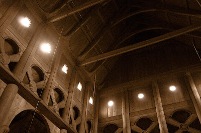


iso 6400, 1/40 sec, f4.5, 24.0mm


This is a view from inside the main chapel. There is no electrical light in the church and it is all lit by the window openings at the top and a few candles near the altar. It is extremely dim inside and a perfect test for the camera capabilities. The metal tubes you see in this image are part of the current sprinkler system to prevent it from being burnt. On the outside along the entire roof sections are other sprinkler nozzles.

Being all wood it was easy to limit the colour noise by de-saturating the colour a bit and then adding a light reddish brown layer set to colour to bring out the warm tones. In Adobe Raw I did set the colour and noise to almost max settings.
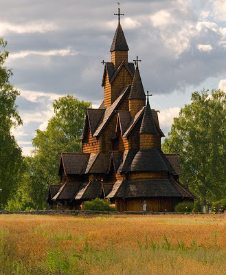


This is the Heddal church, built in the12trh century, is a triple stave church and is now the largest remaining church.
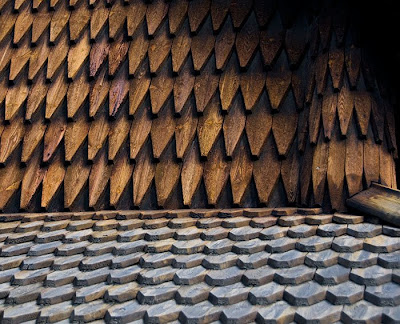

Close-up view of the outside hand cut shingles covering all the roof and wall sections.
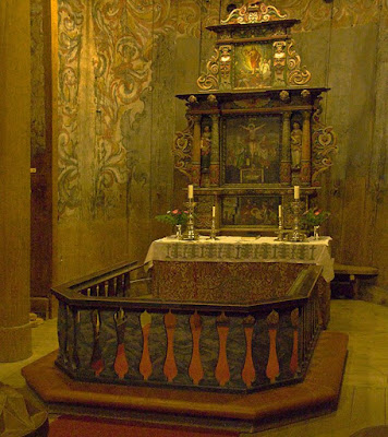


ISO 6400, 1/40 sec, f4.5 , 24.0mm


The above image is of the altar, which is mostly lit by candles and the top window light does not reach into the altar enclave.


iso 6400, 1/20 sec, f4.5, 24.0mm


In the image above you can see the rose painting covering the inside walls. This painting covers some of the more Norse Viking type scenes that originally decorated the walls. It was repainted with the new abstract patterns as the Viking images became out of favour and the Christian teachings and Viking mythology slowly disappeared.

You will notice how the WB has changed from the walls at top being lit by outside light and the post at bottom being lit by candles and therefore a redder tone.


iso 6400, 1/30 sec, f5.0, 24.0mm


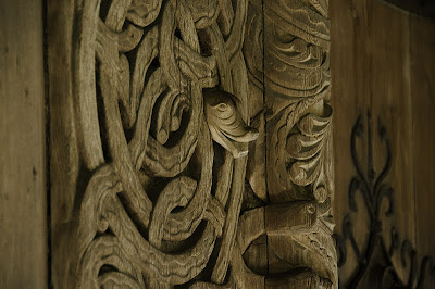
Around the bottom of the church is a corridor that runs around the whole of the chapel and there are different doors to go in. This is part of the carvings that surround these giant 10 foot doors.
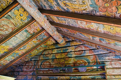


Near the church is a site where they have moved several log cabins as an historic site. You can see the brightly lit rose painting or rosemailing. This is the same as in the church but here we have many windows that provide more light into the interior.
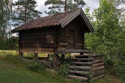


This is a shed on the site but the larger log cabins are built the same method.
You will notice that the log cabin sits on stills and then there is a log split in half and with a flat side on the bottom. This is to prevent rodents from getting into the houses. Note how the steps do not attach to the building, which also keeps them out.

The D300 does a good job of image capture at the higher iso setting of 1600, 3200, and 6400. They are nosier than lower settings but still produce great shots. If you shoot with film and I think the highest was 3200 B&W, these shots would normally not be possible and if you did have very fast film the grain would be very pronounced. I do like the B&W film grain better as the luminance speckles were more random in size and tended to produce better patterns.

You do need to use the luminance and colour noise reduction to improve it. The use of sharpening is not recommended, as it will enhance the noise.

The best method is still to use a tripod and go for longer exposure, but when not possible having an image stabilized lens and high iso, you now are able to get very reasonable images that would not be normally possible.


Niels Henriksen

Sunday, October 19, 2008

The Many Colours of Fall


I was visiting a good friend for a Thanksgiving weekend (Canadian), which in Ontario is just at the peak of the Fall colours. I brought my camera to get some photos of their grandkids playing around and maybe other images of the other guests celebrating the great friendships we have and of course, then sitting down to one of those great feasts that is spread end to end on large dinning room tables.


The photo has a special meaning for me and maybe that is why I have a particular fondness for this image. I do like the stark silhouettes set against the vibrant and brilliant sunlit fall foliage across the pond. There is just a suggestion of detail, the white stripes and the silver belt work and a small hint of skin tones that give them some depth. The 2 people seem to be gazing out over something. Also the red life jacket seems to add another element and its red colour being in the foreground harmonizes well with the fall colors in the background.


There was a third person in the original photo, but for my own reasons I only wanted these two.

It was a reasonably straightforward process to remove the 3rd person, except for the fact I took a slight detour down the path. Like driving a car, some routes are almost automatic. I at first decided I was going to mask out the person and using the same image below move it to another part of the reflection over the opening and using the transform tool to increase size to better fit the opening.

The 3rd person mask was easy, as it only needed to be slightly larger than the person. Objects like foliage with no clear structure blends well, as you can go over the mask edge to pick more or less from one side to suit the natural lines.

It was then I realized that by inverting the image I could use the original foliage and with a little blurring and sizing work make a perfect fit.


I marked 2 cross-hair style grids on the correct version and at a diagonal to each other to determine if there were any angle corrections needed in the inverted alignment.


The bottom part of the image shows the inverted image and how it was compressed vertically to fit the size of the reflected pond.

The inverted image was set to a blur of 5.9 to match the level of blur in the pond surface. Now the new blurred part matched the removed person cutout, but the colour tones were way too smooth.


When I examined another section of the pond I found that the noise was not just speckled but had short vertical patterns also.

The above pattern was created by creating a new layer and adding noise
Add Noise: 200%
Motion Blur: angle 90; distance 26.
Add Noise: 10%
Add Noise: 125% and fade to 8% as I wanted a little more of a building block texture

This layer was set to overlay and reduced to 4%, which seemed the best match the area beside the masked 3rd person.


The above image shows another angle overlooking the pond and a clue as to what the lifejacket was meant for.


Niels Henriksen


A Photographers Adage


The difficulty with color is to go beyond the fact that it's color – to have it be not just a colorful picture but really be a picture about something. It's difficult. So often color gets caught up in color, and it becomes merly decorative. Some photographers use [ it ] brilliantly to make visual statements combining color and content; otherwise it is empty. -. - Mary Ellen Mark,, Mary Ellen Mark : 25 Years by Marianne Fulton , ISBN: 0821218387 , Page: 5


Monday, October 13, 2008

The Red Barn and Hay Fields


I was reviewing some images to select for this weeks post, which was to be on a beautiful wooden 12th century Norwegian Heddal Stave Church. While playing around, undertaking serious fine-art editing, I thought that maybe the image I was working on would be worthy of a few comments on why I was distorting enhancing the versions the way I did.

The main goal with the scene was to try and recapture some of the magic that seemed to permeate the air.

We were on our way to see the huge wooden church just outside of Notodden, Norway. As we got out of our cars in the parking lot there was this large red barn like building that had in front of it a field of late afternoon sunlit hay. These brightly lit fields glowed with a late summer ochre hue. Very warm and dreamlike, at least that’s how my memory recorded the event.
In an earlier article,
What I Saw, My Camera Captured and What My Mind Thought it Saw , I discussed how our perception of events and not what really is there can be locked in our mental image.


The above image is the one I like the best so far. I am not sure that it really captures the memory but I seem to now like this version. The B&W image, further below, does show the glow in the grass better, but for this image a little bit of colour ties with the memory better.

The basic editing these 2 versions was to take the RAW file and adjust for reasonable white Balance. This is the image at the right at 5500K. The sky was too pale and washed out so I changed the WB to 6000K and inserted this as a smart object layer in Photoshop. The reason I use the smart-object layer is because once I mask out the grass and background I can adjust the WB to better match the grass colours in the foreground, which I did in this case. Without the strong yellow it was easy to set the blue to cool.

The 2 Camera Raw version, each with a different White Balance. The warmer setting of 6700 to increase the yellow in grass and background and a WB of 5050 to darken and add more blue to sky.


The next 2 adjustments were a gaussian blur (7px) on a duplicate layer and the masked just for the grass portion. This layer was set this to overlay mode at about 36%. There was curves layer applied just to this blurred overlay layer to fine tune the glowing effect.

Next 2 new layers were added each with its own mask. One to lighten the central corridor to red barn. The other to darken the 2 outer edges of grass to better define this luminous corridor.


The B&W version uses a B&W layer with a darkening of sky (blue slider) and some lightening on the red slider.
The very top right image just has a hue sat layer set at –45 saturation

The 3rd image which my wife likes the best uses a slightly different technique.
It uses a Hue/Sat layer set to Overlay mode and a 2nd Hue/Sat to increase red sat and reduce the blue. The blurred grass layer is set to lighten and reduced so as not to over power the other overlay layer.


Normally I would show you 3 versions of the same image but when I showed the samples, everyone had there own favorites.
Let me know which image, if any, you enjoy. I would be curious to understand how you see images like these.


Niels Henriksen

Monday, October 6, 2008

Your Body of Work or Life Long Project


How many of you are aware that you might be creating a Photo legacy, a Body of Work or Life Long Project(s) by documenting what may appear to be ordinary and commonplace today?

There are several reasons I ask this.

The first is what got the idea going when I was reading one of the photography book reviews on the blog The Online Photographer , I came across a sentence “

His elegiac black-and-white images of America's heartland railroads, bridges, small towns and farms quietly document a world that is passing out of sight.


These people were documenting the places and moments frozen in time, that they love and most likely did not envision at the time that the life they were depicting would disappear in the future.

I suppose maybe some were visionaries and did foresee the disappearance of certain qualities of our everyday life.

With the images of trains I took in Norway I came to the realization that I was collecting images that maybe in the future, many years form now, would form an extensive collection on a specific mode of transportation. The Train. Not that this was original, but for my own pleasure, I was collecting a body of work.


The 2 train engines above are the same model as the 2 that sank in the bottom of this deep lake. The ferry was blown up in WWII by commandos as the Germans were transporting their heavy water back to Germany for nuclear research. At each end of the lake were ferries and at this end there was also a collection of old train cars from the same time period.


It did not start out this way. My first goal was to create a sixptych (3 over 3 images) of trains. I haven’t yet exactly determined the final composition. It will mostly be whole cars and sections of trains. The final mix is not there yet as I still need more to choose from.

It occurred to me since I was compiling and collecting train images that if I were to continue for many more years that one day I might have a good assortment of images that would form a good gallery collection or a photo book on the subject.


There are many things around us today that in 20, 30 years from now, maybe even sooner will disappear or not be in the same mode that we presently enjoy.

I think the traditional gas station might be such an entity. If we continue with the development of alternative source of fuel and if one day we all plug in our electric cars at home, then why the need for gas stations.

What about the music record stores? Especially the old media formats with the LPs, tapes and now CDs?

Do you have any ideas for such candidates for life long photo projects?

Please share your ideas. It might help inspire you to discover a hidden interest.


Take the time to look at the images you have already been collecting and see if there are any subjects and trends that might be a possible theme.

If you’re just starting out compiling images and no project identified, I don’t think that trying to second-guess our technology landscape should be a primary driver in your choice of theme. It should be just plain old curiosity about the common nooks and crannies that we see around us. It should be the need to explore how you or others interface, communicate, ignore, or adapt to the ever-changing society we find ourselves in.


Niels Henriksen

Like

Related Posts with Thumbnails