Pages

Tuesday, August 30, 2011

Book Review: Black and White Digital Photography


Color is wonderful and is a joy to behold but for me there is always something special about a Black and White photograph. I'm not sure if this is because for the most of my life when great photos were presented these tended to be B&W images or the mystique that goes around their genre. But I still find them special.

The world is in color so we don't have a natural tendency to see in B&W but with practice, some inner vision, we can all create good black and white photos.
Black and White Digital Photography (photo workshop) book wants people to be better at this genre of photography.

Black and White Digital Photography (the book)
Author Chris Bucher
ISBN 978-0-470-42193-2
Publisher Wiley Publishing Inc.


The book has 10 chapters and I will explain what is basically covered in each and at the end of the article I will give the overall summary for this book.
This is a workbook of sorts and each chapter has an assignment to help you explore some of the material covered in the chapter.

Chapter 1 – Black and White Vision
This chapter is more of a compendium of general information on importance of Black and White photography, why it is a different art from color. It covers how in the color world seeing in B&W involves more of the creative process. The importance of being able to previsualize, understand the timing in 'the moment' and knowing how to wait.  Where to find photographic material and subjects.

Chapter 2 – Photography Fundamentals
A good general introduction to camera setting such as exposure, aperture, shutter speed, iso, white balance and how these each affect the photographic image. Under composition the rule of thirds, balance, symmetry, shape, simplicity, having a point of view and being able to link compositional elements.

Chapter 3 – Getting the Most out of your Camera
This chapter covers handling the buttons and menu settings on your camera. How white balance affects B&W. Glass filters and suggested settings and lens for portraits, landscape, still life and street photography.

Chapter 4 – Working with Light 
This is what I believe where photography really starts.
This chapter covers metering and exposure, basic zone system, the metering modes of your camera. Light quality and direction as well as reflectors and balancing and mixing sources. Light at dusk and after dark.

Chapter 5 – Tools and Toys
This chapter covers add-ons and supporting equipment for your camera that will allow to take more creative images and includes; Infrared photography, lens baby, smaller point and shoot and speciality DSLR camera, strobes, tripods


Chapter 6 – Tonal Quality in Black and White
This chapter covers converting color to B&W, discussing tones and contrast in B&W images, working with shadows and contrast. Also covers understanding how light quality affects tones and looking for highlights and building depth in the shadows.

Chapter 7 – The Black and White Digital file

The process of converting image to B&W, the use of film filters and the debate on raw or jepg file formats

Chapter 8 – Working in the Digital Darkroom
The chapter discusses the process of enhancing your image to bring out more by use of local and global contrast, multiple raw processing, adjustment layers, masks, shadows and highlight tools, additional filters, selective effects, film situations, workflow. The major emphasis is about using photoshop and digital editing tools.

Chapter 9-  Toning, Coloring and Special Effects
The chapter explains the old film processing techniques and how they can be achieved in digital editing such as; old process effects, split toning, coloring to monochrome, infrared effects, high dynamic range, compositing

10 Output Printing and Presentation
Film was about chemical processes, paper, developing and in this chapter the new equivalents of inject printers and paper, calibrating, creating B&W prints, output options

Conclusion and  Recommended Audience

This is a How To book about creating B&W images digitally. It broadly covers all aspects from start to finish about creating this genre of photography as evidenced by the material cover under the chapters. I don't think little was missed except some freeware program.  The author used higher end equipment,  and computer components and information is geared towards this end.

The book contains a lot of photos and all taken by the author. I like the fact that these are ordinary but good images that we would all take as opposed to those over the top studio shots.

The book does contain assignments at the end and these are general in approach. I am a firm believer that assignments should  be precise and more definitive to help focus people clearly in the direction of guidance. Too much ambiguity for beginners causes confusion in their approach.

There is a web site to post your assignment but at this time (new book) there was nothing posted under the B&W book. This site contains the other workbooks from Wiley press about photography.  Some useful information but a little hard to find since its a Bulletin Board system.
See http://www.photoworkshop.com/  under forum. (the books says www.pwassignments.com but routes to address above.)

This is, in my opinion, a beginners book for someone who mainly uses Point&Shoot camera or mid level SLR type only in auto mode and needs to understand photography, equipment and tools from beginning to end. Each item is well explained but only at a level to get you started and with photography, lots of practice is the key to really getting better.

From my own perspective there are so many books about using cameras I think it's better to leave some of the basic materiel out and focus more on taking B&W and then digital editing.

Niels Henriksen

A bike has so much detail at times its best to focus on particular elements only. In this image you get the feeling of power form the large exhaust pipes.
f.4.4 @ 72mm on 18-70 Nikon lens, 1/15sec, IS0 200

Disclaimer: Other than receiving a book to review, which will be given away, I did not or will not receive any remunerations, gifts or any considerations for this review from the publisher, author or anyone affiliated with this book.

Saturday, August 27, 2011

Why YOUR Photography Matters


I was using Google Street View to find an intersecting street name for a photo I had taken.
The sign in the image told me one street name and since it was only 4 blocks long I figured it should be easy to determine which one of the 5 intersections was the corner for my image.

I tried 3 times to find the corner but with no luck. I just didn’t see my image. It wasn’t until I tried to remember where the streets were steep and placed the google 'bonhomme' on that intersection and looked really hard to find the same buildings, it finally become apparent. It was always there but I didn't see it because of the compression in distance in my image.

F9.0 iso 200 s 1/200 @135mm (202mm at 25mm equ)

The next 2 'Google Maps images' show first at the intersection and the second image taken further up 'Solano y Davalos' where approximately I was standing when I took my photo above.

from Google Street View

These google images don’t show the true steepness of the streets that surround the central square 'el Jardin' as many call it. Only the image in the bottom right, when zoomed in, begins to show similarities.
from Google Street View

Using a zoom lens could bring the steepness of the street towards the end closer and into view. When standing where the street starts to become steeper, the same perception was harder to capture since at that point there were no references to show level as in the zoomed image.

This is why we each need to take our own photographs because only the photographer can tell the story that they see. Mechanical taken images just don't quite cut it.

Niels Henriksen

Thursday, August 18, 2011

Using Guidelines to Increase Focus on Subject


There are several lines that help guide the viewer to the main subject, which is the man & child on the bridge.
Some are natural and some enhanced with photo-editing.

These are:
  • Bridge railings
  • Top of roof (top right)
  • Rippling water starting bottom right. The water just to the left was darkened a little to make contrast greater.
  • The darker 'V' portion of the tree that splits above girls head. This was also darkened slightly to increase effect.
  • There is a dark patch just to the left of man's head that forms a 'C'.  This was also slightly darkened.

I thought I'd show my own B&W photo, as I'm doing a book review in the next article about Digital B&W editing.

Niels Henriksen

Tuesday, August 9, 2011

Are You Being Creative outside of Photography


In most arts lots of practice and if varied does improve your skills and as in photography you need to take many and I do mean many photographs. I do believe you need to be able to see differently.

Being creative, seeing new possibilities in your mind, imagining, also requires lots of practice. There is no formula, like camera settings, that allows you to press and get the perfect picture. This is something that you need to visualize. By not only being creative with your camera, but in post-processing, painting or drawing, gardens or even creating paths in the woods, you will be able to see more with your camera. This playing around gives more space for your imagination to grow.


My stay in San Miguel de Allende did influence my painting style as I decided to try a series of 6 painting about cacti. I wanted each to be slightly different but about the same subject. 

This was more about playing with colors


This is really a succulent but close enough for me.


Each painting  is a 16” x 20” oil on canvas.


Cacti have a lot of greens and this series was about using different greens with complimentary colors.


Photographs were all used as reference material as there are no cacti here in Ottawa. At least non outdoors that I can paint from.

 This image above still needs some minor changes.


Each are different as I hoped and some seem to work better than others. That's the joy of experimenting. You're not quite sure how it will turn out.

The one thing that became very apparent is that oil colours, at least the saturated mixed, could not be captured with a 12 bit sensor. Non of these photos show the true vibrancy of the real paintings.

This is now something to strive for when printing photos. To somehow still have a bright luminance reflect off the photo. This is mostly about contrast and an easy method to create the allusion is to darken and mute color in surrounding areas. There may also need to be some softening to add a bit of glow effect.

Niels Henriksen


Wednesday, July 13, 2011

Improved Method of High Pass Filter Sharpening


It's those little problem areas that upon closer inspection, especially if image is to be printed large, are occurring throughout the image in less intensity. But they are still there.

I have many times used the blur tool in sharpening layers to reduce some of the inherent noise that the process of sharpening brings by its very nature of operation.

I normally don't use the High-pass method in many larger prints I make because of this increased noise, especially in soft areas like clouds or flower petals.


The leaf cluster on bottom left was added from another version to give this photograph a standard triangular view with focal points

To alleviate these noise problems I decided to first blur the high pass filter layer  and then apply a curves adjustment layer to the high pass layer only, to improve contrast with some of the softness created by blurring.

Detailed PDF Document Available
I experimented with 5 other combinations including using the luminance filter (noise reduction) in ACR
for input to High Pass Filter Sharpening.  This document contains numerous photos clearly detailing the process and results from 6 versions. One being the camera default.

It is available on Niels Henriksen Artworks site at the following link.


The reason for creating it in a book format is it allows me greater control over layout and by shifting to a landscape format should filter better with our horizontal monitors.

Let me know what you think about the PDF version.


The above photo shows results for using the high pass filter only and then repeating with a curves adjustment layer applied.  You can see how the veins are crisper and if you look carefully there is less noise on the smooth stamens. The PDF article shows a close up of stamens.

A setting of 2.1 was used for both Gaussian blur and high pass filter. It's always going to be a trade-off between reducing noise when sharpening and still having good edges.

This process will make it easy to create an action in Photoshop, whether modifiable or a straight run.


This is original version. I cropped the details on the  right and also removed some of the leaf tips near flower cluster.  Leaves from another image at wider angle wear to balance the composition.

I always try and take a few extra photos at a wider angle for that just in case you need it.


Niels Henriksen


Wednesday, June 29, 2011

SOFOBOMO 2011

Once again for those who enjoy creative and fun challenges the Solo Foto Book Month (SOFOBOMO) is about to start for its 4rd year. The only downside being that you didn't have a stimulating time.

Well there may be a little stress but this is only self induced by thinking that this project just has to be perfect. After having participated in the last 2 years, the advice I give here is to relax a little, have fun and do enjoy the discovery of telling a story in book of photographs.

You can register and get lots of great information and even view previous years submissions at SOFOBOMO website.

As with most challenges there are some rules but these help to contain the effort to a manageable level.


Red and White Boats from SOFOBOMO 2010 “A Walk around the Pond'

The photos must be taken within the month of July.

Within 30 days of the first photographs taken and used in Book, the e-book (PDF etc.) must be completed.
There is always some planning and testing before your official launch date. Never constrain yourself if you don't have to.

There must be at least 35 images that you took during the 30 days.
For the most part, straight forward but there is some guidance I can give.

White Magnolia tree from SOFOBOMO 2008  'The Land and the River


My own approach is to plan as follows:

Pre-start is about planning your shoots. What  equipment you will use, locations and any weather constraints, time-of-day for sun angles to light objects.

1st week to get out and get the images. For many who work during the week you could assign both weekends to this.

2nd week for photo selection and editing. You need to tell a story in images.

3rd week to layout the book and write a few words if you want but not required.

This gives you an extra week at the end to overcome any problems, like needing more images or more time in the other parts that always seems to go astray.

The key item for me is that I am not trying to create a book that will sell millions or even 10s, but a book that I will enjoy and in the process learn more about what it takes to make a book.

Part of undertaking the SoFoBoMo project is to enjoy the process and learn to be flexible in your approach. There are always some things that will pop up that causes a change in the course. If you enjoy what you are doing and are not concerned with what others are achieving or how they will view your book, then adapting should be part of the excitement and not a frustration. 

Garlic bud in light tent form SOFOBOMO 2010 'Food at My Table'

Remember that any planning work and getting equipment and tools together is not part of the 31-day window. Take your time now to get it all right, because you can start anywhere within the month of July and this will help you out later on.

I find it’s best to have a back-up theme, while probably not as good as your first choice, it will allow you to complete the book should something unforeseen happen with the first idea. Completing the book is more important than how super your images are.

I have more detailed advice in the following link below

10 Great Photography Projects SOFOBOMO


This is a great project and challenge and I strongly encourage everyone to make a stab at it.
You just might end up with a good book that you could publish and hand out at Christmas or other celebrations.

Niels Henriksen


Monday, June 13, 2011

How to Approach Editing your Photographs to Create more Visual Appeal

Big title, a complex subject and almost impossible to answer correctly. The key ingredient is the photographer who took the image and not a critic commenting on his or her own vision. Even though these comments might at times produce a better result, especially if technical problems persist. If the image comes with a statement or feelings or any other human/artistic guidance then it's easier to comment on how the image achieves these goals.

The yellow green hue of main tree shifted more yellow less green. The greens shifted cooler, bluer in green, and desaturated and darkened slightly as greens are always stronger than yellows. Bench made more teal to better compliment the yellows.

Pre-Visualize
The initial step to capturing a better image is to first understand what those elements or emotions are in the scene before you that excites or intrigues you. Sounds easy this self analysis but if it truly were easy then there would not be as many self help books all saying they have the answer. The same applies to my advice. Take it with a few grains of salt, shake well and wait for the dust to settle.

I believe that the more you immerse yourself with good and bad (if there really is bad) art, the more you come to understand your own emotional drivers. Seek out not just photographs, but paintings, sculpture, drama etc. Some are born more wild and for these individuals maybe too much art exposure may limit their own wild creativity. But for the vast majority of us, exposure is a good thing.


The tree had such a glow in the morning light and with such a tranquil setting it almost seemed the perfect place to contemplate. The glow was very important and being backbit helped this effect. By going to B&W and then increasing the yellow slider to almost blow out texture helps to make these leaves glow. Once again, I darkened and slightly blurred the grasses as each blade was too strong for this scene.

It's not always possible to pre-think an image, as sometimes the scene unfolds too quickly. All we can do is react and hope our training ensures proper techniques and the correct settings.
With any subject, what is it about this object or collections of objects that you find interesting?
Is it it's novelty, color, contrast, action, humour, memories, emotions, abstractness...?

When you do understand what is driving your vision, it becomes easier to place the focus correctly. Not camera focus or rule-of-thirds etc., but your visual focus of photograph, then ensuring that other elements in scenes do not compete for focus.

It's easy to see those elements that grab you but harder initially to see other parts that don't quite fit perfectly. The best advice is for you to constantly take photographs and where practical, many more than you think you need and from way too many angles. You will learn to see differently.

If it's primarily color then what other colors around either enhance or detract. Then move around to best find enhancing elements and reduce unwanted components
The same applies with details, lines, textures, contrasting shapes, size etc.
Start to think less of the subject and focus more on the surrounding pieces and how each helps or detracts and then using compositional theory when merited, compose your scene.

Here you can see this single yellow tree sitting in an open field, sunlit with lots of dark backgrounds to help increase visual contrast. This tree is what excited me and I knew that by walking around 360 degrees I would be able to place the tree and bench with good backgrounds. This was a morning shot and I would have liked to get an evening shot with the bench in the shade.

I know that the camera photo is never able to truly render a green landscape scene in the same manner that we visually observe. Those ever so subtle movements outdoors help us to see more with all the greenery around.

Photo-Editing
One of my favourite techniques with greens is to shift greens in certain parts either warmer towards yellow or cooler towards cyan. A little tonal contrast color difference, even when slight, can help to increase visual contrast.

The same techniques that went into planning the photograph should also be employed in photo-editing.
If main interest is:
Fine Detail and Texture - blur or lighten/darken other parts or reduce contrast. Increase contrast of subject detail.
Color – desaturated other colours. Change hue to better compliment contrasts.
Eg. If you have 3 blue balls spread out on the beach, then for the closest ball, increase saturation and only 1-2 degrees warmer towards red. For the other balls or circles make them lighter and bluer as distance increases. Only subtly so you don't notice. You may also want to slightly blur with increasing amounts as you move in distance.

The top image has the blue circles all the same color, whereas the blue version on the bottom is using the editing example mentioned above. The bottom group of circles provides more visual evidence of depth. 

The Hue/Saturation settings are listed shown in the same order of changes.


Don't forget to capture other images around you even though they are not currently your main interest as later you may find them more appealing when looking in isolation for what originally captured your heart. The tall skinny trees in front were just a bit lighter in colour and I found that in B&W I could best increase contrast from remaining foliage.
With one of the channel masks I first shifted the hue to more yellow for these trees, which made it easier with Black and White slider adjuster to lighten yellows and darken greens. Greater contrast from background.


As with the first image, lime-yellow leaves shifted more towards yellow and lightened. Green more blue and darkened.

A camera is light with a paint brush and with a canvas you can change any part if you want, unless the point is to document historical accuracy.


Niels Henriksen

Thursday, June 2, 2011

New Fine Art Prints Series and Upcoming Print Exhibition


Fine Art Prints
A few months ago I printed 5 prints of a new series of my photographs.


'Fire Within'

Each photograph is printed in a series of 5, numbered, titled and signed.
The photographs were first printed 8”x10” on approx 6 different types of fine art matte papers to determine which paper best enhanced the features of the photo.


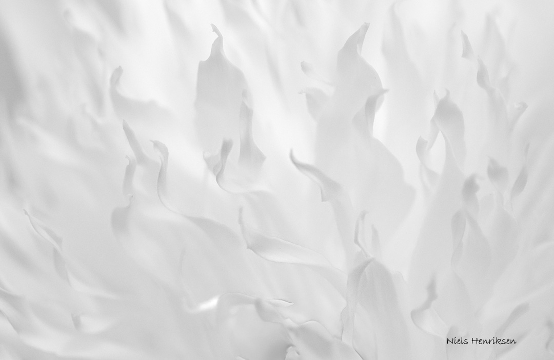
'Dancing Flames'

As with the photo above, which is high key, low contrast and soft in details, a heavier textured paper was used to add visual interest in the smoother areas.

'Bicycle and Orange Wall'

For the image above, a warmer and slightly smoother paper was used to help the yellow-orange glow  even more.
'Bare Trees and Fog'

For the tree photograph a brighter and cooler paper was used.
Please visit Niels Henriksen Artworks website for further details about any photograph shown here.
Each photograph is listed under the Fine Art Print tab.

Upcoming Print Exhibition
Next week on June 9th there will be a Vernissage at the Orange Gallery in Ottawa where Camera Club of Ottawa will show some of their members photos. I will have the above series at the gallery from June 8th to June 19.

'Boat in Grass on Beach'


This is a wonderful opportunity to see a great collection of photographs from many talented and varied photographers. As photographers, we should take the time to support our fellow artists and attend  their showing, if for nothing else but to enjoy photographs as they should be seen. Large and printed.


Niels Henriksen

Wednesday, May 25, 2011

Experimenting with Photoshop – Hand Coloring

I had originally prepared an article on a useful iPhone app that tells you exactly where the sun is at any location on the earth, any time of day. After writing the article, I tried to find its web site to get specific details only to found out that this app is no longer available on the iTunes store.  Strange as it is, it's still loaded on my phone. There is another program (Photographer’s Ephemeris) that is very similar and maybe even a bit better but it is not free however, the PC version is free, which I have.


Therefore, I thought I would show some of the experimenting I performed with photo-editing.

The original idea was to convert an image to grey scale and then by using duo-tone features, hand color (mask in) specific objects or areas within the image.
I also wanted to change the colour warmth or coolness differently for the shadows and highlight for each objects so that the colour tone was not uniform in hue for the entire object. Naturally a 3 level duo-tone works well, but only good for one shot so to speak.  Can't add different tone sets to different sections of image.  The solution was to create copies for each tone set and combine them into one image and masks for each sections. In the grassy area I cooled the greens. For the yellows this worked great as it also changed any green hue in the top leaves to yellow. For the red sections I saturated and cooled slightly the shadow and mid-tones to better match the now brighter top section.

The original photo is below.


Each color layer was an individual tri-tone that was copied to this file.

It was a bit cumbersome using the duo-tone function so, for the next grey-tone image, which has clear defined detail, I used the color blend mode to add color. Then with the sliders on each layer I was able to adjust for the shadows, mid-tones and highlights for the same mask .

Tri-tone for wall, duo-tones for jacket, pants, door frame and sidewalk.
You may surely wonder that this is a lot of work for “how-much” benefit and I tend to agree. This was foremost an experiment and I love playing around to see the type of effects I could archive. The thing I like is that all the shadows have cooler hues than the mid-tones.

I now know that in the future some of these steps may be added to certain types of images, especially like the first image.

Leave a link if you have done anything similar or even something strange with your image editing.

Niels Henriksen

Tuesday, May 3, 2011

San Miguel de Allende – Part 6

This final set of photos from San Miguel are an assortment of odds and ends. A potpourri of fun stuff.

There was just something intriguing about this old German VW bug, not in pristine condition parked at Berlin bistro bar along Pica Sila Street. I used an overlay effect and some 'curves' adjustment on car only to make it more grungy.


At the school cultural event with the hundreds of kids (see link People of San Miguel ), it was difficult to isolate the subject for other children. With these 2 boys I was able to get grey background to help the boys bandannas stand out.

There is already enough color with the bright building in San Miguel so when you find a subject even more vivid, it just begs to be photographed. I did use selective contrast enhancement of the man's clothes.


In Juarez Park there are, especially on weekends, artists who display and sell their painting. The long bearded gentleman clearly typified for me the appearance of a classic artist.

This image was discovered when I was reviewing some of the photos taken. When you walk along capturing interesting moments you don't always notice everything in the field of view. This can be bad but sometimes good. In the photo above I like the disconnect and differences between the lady on the left and the 2 people interacting on the right.

There is nothing quite like a good fish market. I feel you're not experiencing the local flavors until you find places like these mixed in with all the other vendors around.

The el Jardin Park which is officially Plaza Allende, is the favourite gathering place of almost everyone in San Miguel. A wide collection of people show up from big show bands to nightly mariachi bands to single soloists.

One item that never ceased to amaze me is the bright jacaranda trees that were in full bloom.


Niels Henriksen

Like

Related Posts with Thumbnails