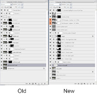
This blog is about re-visiting an old friend or should I say like looking at my old high-school photos and they can seem strange today. This was one of the first images were I spent considerable time enhancing it in Photoshop to make a print of it.
I thought I would compare the approach I took then with a new version today. The first assumption even before looking at the editing processes is that I surely could do better then I did before.
This image was submitted to a B&W print competition for the theme of ‘Massive’, if I remember correctly my first print competition. Ah the innocence or is it ignorance of youth (not age but in beginning a journey to improve my photographic skills).
Updated version
When I first looked at this image, what I saw were these ‘massive’ brick walls and rock outcroppings that were, to me, made even bigger by the inclusion of the small seagull. The coarse texture of the brick walls balanced nicely with the smoother yet still jagged texture of the rock wall. The tortuous water just complemented the hardness of the walls.
The only comment I received by the judge on a well-printed B&W image (see “Orig” below) on semi gloss paper was that the seagull, which is where his eyes kept going, did not seem massive to him. Judges can be cruel. Most judges are good photographers but not all good photographers make good judges, as it’s difficult to find the right balance with regards to critiques.
I have learnt a fair amount from these types of judges, at least with interacting with the participants and in my own judging I am always careful to point out some positives about the image as well as the areas of possible improvement.
The first process was to analyse the basic Camera RAW image and identify the stronger compositional elements and use the photo-editing process to support these.
The image has many supporting horizontal curvy lines that help to create and support the perception of movement. The major lines are in yellow below.
When an image is meant to stand alone on its own merit, it is important that there are visual gaze patterns or points of interest that keep our eyes moving through the image and returning to those emotive parts.
The blue line shows a visual course through he image, which I will need to enhance with contrast separation.
In analyzing the image I found that the brick wall did not provide enough contrast separation with the rock wall, which was to provide a visual guidance downward. I worked separately on each of the blue-circled areas within the photo below. I would also try and introduce the appearance of a shaft of light striking downward towards the bird.
This is the unedited RAW image
The original image has the bird more in the center, which is not a traditional power point and in the revised version I moved it to the lower left third.
In my vision, one of the key elements is the icicles on the edge of the rock face and this is one item that I wanted to enhance the contrast to make them jump out more and help the gaze downward.
I did like the white writing on the wall and unfortunately these are on the top edge of the image and have the potential to take your visual gaze out of the image. I therefore decided to darken the top edge, to not make it such a powerful exit point. When I looked at the approach I took to create the final image, it is easy to see that I have learned and developed my skills over the years, at least with Photoshop editing and workflow processes, but I was surprised at how close the analysis remained today.
The comparison of the original raw version and the 2 final versions are shown below.
To give you a better idea of just how wonderful this area along the Ottawa River at Deschene’s Rapids is, I have included a photo from a little further up the river and you can see the Ottawa skyline in the background.
Niels Henriksen
A Photographer’s Adage
A good photograph, like a good painting, speaks with a loud voice and demands time and attention if it is to be fully perceived. An art lover is perfectly willing to hang a painting on a wall for years on end, but ask him to study a single photograph for ten unbroken minutes and he’ll think it’s a waste of time. Staying power is difficult to build into a photograph. Mostly, it takes content. A good photograph can penetrate the subconscious – but only if it is allowed to speak for however much time it needs to get there. - Ralph Gibson - [cited in: Creative Camera December 1972, p. 401]
Sunday, January 20, 2008
A Visit to an Old Friend
Labels:
B and W,
Old Buildings,
PhotoShop,
Water
Subscribe to:
Post Comments (Atom)
1 comment:
Wow what an amazing blog! Your way of analysing pictures is really cool.
Definately an added item in my RSS-reader!
Greetings from Alexander Lindeskär
alex006.deviantart.com
Post a Comment