Pages

Tuesday, December 15, 2009

HDR Photo with the iPhone

The new 3G iPhone is one good camera to have integrated with your cell phone.  The main feature for HDR is the ability to select different areas of the scene and at the same time bracket your exposure. Then with Photoshop or other similar photo-editing apps, combine these multiple exposures into an HDR photo.

Its often been said by many photographers that the best camera is the one you have with you and for many of us this means a simple built in camera with our cell phone. Only simple if compared to many full-featured cameras today but if you just look back some 20 to 30 years, these camera phones are just amazing.


3 exposures used for combined image

The iPhone automatically adjusts its exposure setting for the area selected within the focus box. By tapping different parts of the image, it changes its focus and it also adjusts the exposure compensation for selected area. Select a dark area to lighten and a bright area to darken. Try and select uniform tonal areas and watch how image adjusts.


The 4 different exposures taken for the pond image above. In the end I only used 3 of them.

Without a tripod or other solid support getting multiple exposures of your image with the iPhone, that overlap perfectly, is not an easy task.  There are some tips that can help you achieve better results:

Try to lean yourself or arm against a solid stationary object. If not possible, lean or squat so your elbow can rest on your leg or another part of your body.

Once you have your scene selected examine the 4 corners carefully as these memories will be the markers for ensuring that the next image is reasonably aligned. With practice you can get quite close. One problem if they are too far off is the final image area decreases to only the overlapping parts.

For complex scenes like the frozen pond above, take many images by selecting different areas of the image for focus. This will ensure wider coverage and sometimes all you need is a small area to add in and alignment is easier for smaller parts.
 

Just at sunrise with moon near treetops

In Photoshop, I use the difference setting in layers mode to align the images. Once I get the area of the image I will be using reasonably aligned I use either the Transform or Warp functions to fine-tune specific problem areas.
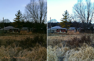
 

Don’t spend too long on aligning the 4 corners, as it’s easier to just copy layer and align the new area that you wish to use. Normally the change in angle distortion between images is only notable over the entire image. Small sections work fine.

I find that with the iPhone’s wide angle, that any small movement creates bigger distortions at the edges of the image.

It’s not a prefect tool but when the camera phone becomes the best camera you have then with multiple exposures you can get good photos in high contrast settings.


First Snow Fall of the Season

The other day we just received our first snowfall and nice 2” or 5 cm of the fluffy stuff.

As I was heading out for my morning walk, the sun now stays at a low angle a lot longer and the fresh tracks in the snow were being side-lit on the inside edges which gave them a luminous glow.


It’s interesting to watch the tracks that we leave.  Each track, whether they’re from boots or bikes, are different. 


Strange how great it seemed that day because 2 days later we had 10” or 25cm of snow. A lot harder for a walk-about.

Niels Henriksen


Monday, November 30, 2009

Obsession, Madness or Just Good Photography

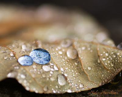
The other day, while sitting on the back patio enjoying the late warmth in November, I saw this singular leaf sitting on the patio stones. You might rightly think, “well this is fall, what do you expect?” but there was something different.

It could be that the leaf was all alone but what really caught my eye was these huge rain drops sitting on top and from the angle I was looking, each drop radiated brilliant crystalline light.

The sky was lightly overcast and the droplets where reflecting the bright white sky in my direction. As I moved around the leaf the droplets would change from a silvery white to magnifying (like a lens) the patterns and textures contained under the droplet.

I wonder if I could make something wonderful with my camera and ran inside to get the camera. There have been times when I have waited too long to go back to photograph an item, only to find that the conditions have changed and it was, now, no longer possible.

There was nothing really unique about the leaf or the stone background in itself, to make an interesting composition. I decided maybe with some close-up shots I might be able, with unique perspective, to capture an interesting composition.

With that view in mind I grabbed my tripod and 90mm Tamaron Macro lens.

With the aid of a cushion, I explored every inch of that leaf and probably did it several times over. It was until I was finally finished that I realized that I had taken 313 images.

This is where the title links in. Was this an obsession or just good work on my part?

As yet, I don’t know. To be fair to myself, I was shooting macro mode and therefore focused incrementally over all parts of the leaf, in case I wanted to combine them into one clear image with greater DOF.

I wanted to create the effect of a snowstorm in a globe that contrasted against the delicate and muted tones of the rest of the leaf.

I did 3 different scans with the camera over the leaf and few others for artistic effect.

The one good part is that while the shooting was going on I was completely lost in my world, exploring different angles and lights and that alone was fun.

Now, what to do with all the images. I have learned not to be too obsessed with previously taken images. One day I may find a good reason to dust them off. I just need that brilliant idea to mirror with the right images.

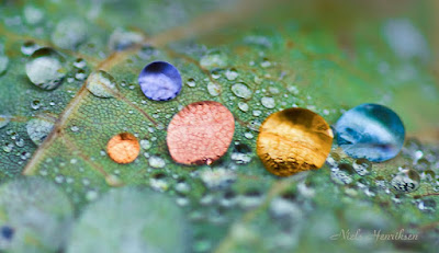
I enjoyed playing around with changing the colours of the drops.

For this set, I decided to select a few and see what I could do with them as I am not sure that they will all stand on their own without some retouching. There are interesting patterns and textures and in some parts, subtle colour transitions.

This is part of what makes photography interesting for me.

Niels Henriksen


Related Articles

How to adjust any color without effecting other colors.
Adjust any Colour of the Rainbow with Blend-If type Sliders

Tuesday, November 17, 2009

Night Photography – Ottawa’s Lumière Festival


Once a year in Stanley Park, Ottawa has a festival of lights, music and magic. This grand visual display is called the Lumière (French for light) Festival. This large park along the Rideau River is bedecked with all shapes and sized coloured paper candle lit lanterns.

The festival organizers, I imagine volunteers, create some rather stunning and tall (over 7 ft) coloured paper lanterns in the shapes of fairy like objects. Local supporters, and I know because I’ve seen some regulars, have their own light displays set up along the many paths in the park.

The visitors make and bring their own lanterns and there are a few for sale at the site as the bottom image shows.

75mm, f5.0, f5.0, iso 400, 1/60 sec

The festival starts to get underway around 4:00pm with only a few people starting to arrive. The main event doesn’t happen until after dusk (9:30pm).


Lens Choices

While the night shots would involve the use of the tripod and long exposure times, I chose a heavier lens for the first part of the evening. There is still natural light however, that light is obstructed by the many trees lining the pathways.

The lens used was a Nikon 70-200mm f2.8 vr to give me the extra light capturing ability around dusk, as I learned from pervious years that when there is a lot going on, this allows me to quickly point and shoot. I also bumped up the iso to 400 for more light as with this setting there is no noticeable noise with the Nikon D300.

When I switched to the tripod I chose the Nikon 18-200mm, f3.5 vr lens. I knew for some shots, with all the people around, I would need a wide-angle lens and get in close to not have people block my view.

200mm, f5.6 iso 400, _1 ev comp, 1/125sec

At first impression you might think that I have oversaturated the green in this many-sided triangular hanging. I did increase saturation but only slightly because if you start to over sat then you also loose the subtle tonal transitions, here in the greens and yellows.
I used a technique form my painting experience where you can alter any colour by what is placed next to it.

I darkened and de-saturated all the green foliage to make this object appear more vivid. I increased the saturation of the purple flower slightly to give some balance with the strong green colour. If all the remainder of the scene were de-saturated then the green object would seem out of place. Almost cut out. It needs some anchor points in the scene. I did also rotate the direction of the person on the right, to be entering the scene as opposed to leaving it.

handheld, 18mm, f3.8, iso 400, .5 sec

This is a 6 ft display of skyscrapers made of blue tissue paper with other colours glued on. One benefit of this time of night, while this path is packed elbow to elbow because of the darkness they don’t show up unless they are carrying a lit lantern. I had several versions of this location, but I chose this because the dark blue sky helps to add some abstractness to the already abstract blue towers. You can see the other lanterns dotting the pathways.

Tripod, 26mm, f3.8, iso 400, 2 sec

One of my favorites of the evening is this image where the petals are picking up the glow from the yellow light. The yellow tip of the flower is 7ft tall with the petals going higher.

This image is 2110x 350 when you click on the above thumbnail

A composite of the many different hanging lanterns found along the paths. In the last image, the cones are 6ft tall.

The Grand finale


tripod, 150mm, f10.0, iso 400, 5 secs

This festival is really about the grand finale, a baseball diamond filled with brown paper lunch bags with sand in the bottom and a lit candle that, in all, form a giant walking maze. All the kids and parents snake in a long procession through the intricate loops in the maze.


tripod, 150mm, f10.0, iso 400, 5 secs

If you examine carefully near the top left, you will see ghost like outlines from people who had lighter clothing on. People with dark clothing don’t show up at all. From this viewpoint it almost appears as there is no rhyme or reason to route through maze.

With a slightly different camera angle some of the curved paths start to show up.

tripod, 150mm, f10.0, iso 400, 2.5 secs

This festival is a huge hit for parents with kids. Before it gets totally dark, there are numerous entertainers from outdoor plays. Some with stilted costume performers, singers, folk dances, jugglers, and many other strange things you find at lighted fairy nights.

For camera buffs, and there are many that show up, this is a great chance to photograph very unique and colourful people and objects and later on some truly great night photography.

Niels Henriksen


Related posts

Ottawa Luminère Festival a Night of Magic Light

Night Lights – Slow Shutter


Ottawa Lumiere Festival

Tuesday, November 3, 2009

Are All Photographs Works of Art?

The images in this article are from the Ottawa 2009 Lumiere festival which I will be describing in the next article, as I will have too many images to show, I will therefore focus in this article on the some of people who help make this festival such a joyous event.

On first reflection I was going to say “yes”. It seemed easy to state with how I thought about art. Art being that ‘thing’ when something unique is created by any person. You will note that in the title there is no adjective describing whether the work of art is either good or bad. Value is different as those who would prescribe a monetary amount in order to preserve the artefact define this.


It seemed to apply to photography since it requires a person to make a conscious decision to capture a moment in time from a unique perspective. The person may not know it at the time of taking the image that they were even creating a piece of art. But I believe that even then there was some creative process that urged or guided the person to decide that the image now composed in the viewfinder is the ‘one’. The original intention, either as a memory aid or used with others to help tell a story or convey emotions about a specific place and time, is not important.


Some of you might debate there should be more than just the snapping of a photo to create works of art. I don’t think that’s the case. I know my own biases creep in from time to time and I think that there needs to be an artist, a person driven to create, to show the world a new way of looking.

We call cave paintings works of art and I think that at the time these were meant more as sign posts to show events of locations for food. But these people did create a unique way of looking at the life that unfolded from their daily lives. I wonder what the others thought when gazing at these paintings, as there were so few around. I think almost mystical.


When I started to think about some photographs that had no human intervention, I wondered whether this type of image would also be applicable. In our society there are many forms of surveillance and these, as a unique image or sequence (movie), are not in my opinion, works of art. It doesn’t mean that some person later may not go through a large database of images and from that set create a perspective that is somehow unique.


I think even photographers who, without looking at their viewfinders and walk through a market and snap images from their hips, as still creating works of art. Now some may be poorly framed, wrong focus and ill-defined subjects. But somehow a person is trying to capture fleeting events and in that process creates works of art. The process can become part of the how the work of art is defined.

It will be up to others to really define a value. You can set a price, but the real value is defined by individuals who collectively determine its worth.


So even if you decide to set up a camera at a spot to take images randomly or on intervals while you are not around, I still think these are works of art. Will I buy one? I don’t know but you never know, as one image might just impress enough that I feel a need to have it.

So in summary, I now think that not all photographs are works of art. There are times when the capture of the image is for the most part only being captured mechanically and the human touch, however light, is just not present. Now if a person were to sift through all the pile of images and select some for the telling of a story, then at that point those images would form a part of works of art.


Niels Henriksen

Saturday, October 10, 2009

Capturing the Splendor of Fall Colours

The winners of the Free Print contest are Amuary and Paul and please contact me for details about selecting your print. I sure wish I could give everyone an image but cost prohibits this. I may try in the future to do this again

I would also like to thank all those who participated and provided comments to help me understand about people’s desire to display printed photographic artwork.

The Colours of Fall

In the northern hemisphere and especially those with an abundance of deciduous trees, fall is a spectacular season of colours. To the eyes it’s like an explosion of bright sunlit yellows, oranges and reds that almost seems to overwhelm the senses. As photographers, the desire is strong to capturing these fleeting moments with your camera.


But upon reviewing the captured images they never seem to quite capture what our impressions where. It doesn’t mean that you didn’t capture good images it’s just that the camera records statically the scene, while your eyes actually paint a memory in your brain.

We tend to think that our eyes take in the whole scene before us, but in actual fact it has a narrow angle of view for colour and detail. It very quickly moves about a scene creating an impression of the whole. It is this, if you will, many snapshots of specific elements with each having it’s own vibrancy and focus points that lets you take in the wonder of the whole. It creates a memory that is more vibrant and dynamic.

In a previous article, I wrote about “ What I Saw, My Camera Captured and What My Mind Thought it Saw” ” that provide another example.

For the most part, this fall foliage is akin to splashes of colour on a canvas. It still needs design elements to tie it all together. A classic scene, which is hard to get in my area, is a panorama of overlying rolling hills with maybe just a touch of water, either a lakefront of even better a meandering river. Even mountains will aid this scene. They help by providing lines for the eye to move about the scene and thereby keeping the viewers interest.

In my on case I don’t have these so I find it is better to isolate the few splashes of colour and tie it together with other interesting elements.
In the above image I used the Photoshop Smart-object feature by layering different versions of the same image in Adobe Camera RAW (ACR). Two of these were just to create individual masks for the red and yellow tree. This was achieved by increasing the luminance for the specific colour and reducing for all the rest. This made it easy to find a good mask and with a little curves adjustment and some clean up. I then created a version for each colour that enhanced that colour for its best attributes (red and yellow) and used the masks to make them stand out. Another was used to darken and reduce saturation for the other foliage and a final version for the blue in the water. The reason to use the smart-object feature is like in paintings, a singular colour looks different when combined with other colours. I need to fine-tune the colours to better match the others when composition is complete.


The above scene can easily fool the eyes. Because the duck is low to the water and there are imperfections in the water stillness. You might at first glance think that the horizon line is between the 2 duck images. In fact the horizon line is at the very top edge of the image.

The image below gives a better view of the types of foliage encountered near Ottawa. Lots of evergreens interspersed with colourful deciduous trees. Occasionally, especially near fields, there are pockets of only deciduous trees brightly coloured but it is hard to find grand vistas of fall colours. These pockets, while quite brilliant, mostly don’t have any other elements that will get the viewer to spend time on a scene.


The above image is a simple everyday type image, but there are many elements that keep your gaze moving and thereby spending more time and hopefully enjoying it more. As photographers, that is what we try to achieve with our photographs, viewers spending time on the image.

Below with graphic overlays I have highlighted those elements that aid.
The man’s red toque, red speed sign and red marker buoy from a triangle that aids the vision in moving around the scene and ultimately leads you down the river.

The red circle is a final destination, almost a resting point for the viewer’s gaze. The man in the boat is the strongest contrast and becomes the initial focal point. Its closeness to the red circle helps to draw you in. The Speed sign and the red marker buoy also provide leading lines to the red circle. The green arrows provide diagonal and horizontal lines that re-enforce the moment to central area.


Niels Henriksen

Sunday, September 20, 2009

Are the Photographic Print Dead?

The free print contest is still open for the month of September. Please leave a comment with the words ‘free print’ included in your comment. I have included some sample images to give an idea of the range of images available.

The title may be a little tongue-in-cheek, as I know there are still a few places where they are in demand and in some ways this topic seems to go against my desire to give away prints.


The reason I ask this is that I wanted to thank my regular readers of ‘My Camera World’ blog, for consistently dropping by to read my articles and view my images, by giving away 2 professional produced prints as a contest. The threshold was when I first reached the 1,000-subscriber mark.


I was completely bewildered when there were very few regular readers that wanted to take a chance at receiving a print for free.


This goes against my other world (not online) where I do sell a few prints at Art fairs and galleries. 11”x14” prints normally sell from $120-$160. I have even had a few sales on the web-based art sites. I have a set of 10 greeting cards printed on 5x7 stock that are in reasonable demand. I know of 2 people who framed some of these cards as the image goes edge to edge.


So far, if I am correct, most of these sales have been to non-photographers.

So I wonder about the following thoughts I have about my readers:

  • Do photographers not like to hang prints by other photographers?
  • Are prints only wanted from big name photographers?
  • Do photographers not have extra room to hang an image?
  • Do my blog readers not like to enter contests?
  • Is the cost of framing an image prohibitive?
  • Do photographers not like to collect other photographer’s prints?
  • Do blog readers not trust free give-aways?

I know many of my readers are photographers and most, if not all, I believe would also like to sell their prints.

I would really like to hear your thoughts, as this is something I just don’t understand and with this discussion we could all help each other better understand the photo print market.

I display and collect other photographer’s photos. Its just plain fun to see the work produced by them. Maybe my kids or grandchildren will benefit the appreciation of value with these photographers.


To have an 11’’ x 14’’ image printed on Epson Ultrafine art paper costs me $51.00 by the professional printmaker I use. I estimate that shipping will run about $15.00. So, as you can see, I was willing to spend up to $130 out of my own pocket just to say thanks. There was really no other motive.


In the article on Pixsylated blog Sly Arena in an article ‘Digital Photographers, Welcome Back to 1999 ’, it discusses the demise of still photography with the greater emergence of video.


If video does become the new dominate form, and I think there is a tendency to go that way especially now that large screen TVs or should we call them integrated home entertainment systems, there will be a greater reliance on this item as the preferred display medium. Being it rotating photos, slideshows or videos the wall screen will slowly replace paper.

Video has been around for a long time but it is only in the last few years that we have the real freedom to choose content, type and time. Before, it was limited to mainstream TV and home film movie buffs.


As always there will be collectors of the old ways. Even today there are a few who still prepare glass negatives, but this is such a small set of individuals. Almost like a lost language or tribe to be studied by others.

In the meantime I still produce images of photo paper and cotton rag for those who appreciate the printed form and I hope there are more who still do and will even take a chance on one of mine.

Thanks for your interest.


Niels Henriksen


Monday, September 7, 2009

Sun, Earth and Moon Composite

First I want to mention and support a fellow photographic blogger Damien Franco of ‘Your Photo Tips Blog with the launch recently of his endeavour to open a new sharing forum for photographers called Exposure . Not only is this a great place to learn and share from others but also there will be 8 prizes given away with this launch.

I have become a member and I encourage you to join so we can all learn and enjoy photography from each other.

My Giveaway of 2 Signed Prints

Well it’s now September and as I stated in a previous articles, I will be giving away 2 signed prints of your choice by random selection. All that you have to do is leave a comment in any article published in the month of September that lets me know you want a free print. You do need to mention the word ‘print’ so that I don’t confuse a comment with a spam comment. If you don’t feel comfortable with a public comment then please contact me via email.

I will be collecting the requests during the entire month and at the end of September I will, with the aid of a random number generator, select the 2 winners. These will be shipped for free to anywhere in the world (I hope you are not in an Antarctic station right now) in a tube container.

The images will be your choice and up to a size of approximately 13in x 19in on archival paper. The prints will be signed but un-numbered as they will not be from my limited edition series of which there are only a few now.

You can either view the images I have on various sites and select one or if you wish, I will ask if you have any preferences and select sample images for your review.

Back to Sun, Earth and Moon Composite


In the fields I saw these flowers in several stages of opening to the full flower and one particular set reminded me of the planets with the Sun Earth and its Moon. I decided to take an image of each flower against a black backdrop and combine them as a composite.

I tried to do a similar image with the original flowers in situ but because of their short stature (8 inches high) and their various lengths of growth I was not successful in sufficiently blurring the grass and having all flower tops crisp and in focus. The image below shows these plants as found.


With this tripod setup I did take an image with each flower in focus and then another set progressively blurring the grass below. I thought I might be able to create a semi-real image with sharp flowers and blurred grass but when working on the images I soon realized just how much work it would be to finalize an image. The main problem was trying to blend in the different stalk DOF blurs into a realistic image.

Even the black background version took 2 hours with a Photoshop file of 250Mb and containing 16 layers.

I have a drop cloth that I use while painting and I tried a few with this as the background instead of the black as shown below.


While there is interesting texture I don’t think it was going to work as well in a 3-image composite. As I am accumulating more and more paint on this drop cloth I realize that this will form a very interesting abstract background that I can use for photography.

If you know a professional painter, you may buy him or her a drop cloth to use and wait a few months to collect your new background photographic cloth.

Blog Subscriptions

If you are not already a Blog subscriber but like to know when a new post is available then please subscribe in one of the blog readers or with the convenient method of receiving these articles via email. Just click on one of the subscription modes in the top of the screen and it will take you through the process effortlessly.

Niels Henriksen

Wednesday, August 26, 2009

Painterly Effect with Photo Enhancement Techniques

While deciding on an image to work on and achieve something special, I remembered a scene while in Copenhagen this spring. It was early morning and there was this lovely textured stucco wall in the dappled light with bicycles, benches and an old oak tree (at least some majestic type).

In reviewing file archives, I found that I had only taken 4 images in the entrance square to the Frederiksberg castle grounds in Copenhagen. Of the 4, there was only one that caught my eye. I now wish I had spent at least a couple of hours, if not all day, here to watch how the sun changes the light in the courtyard and how reflected light modifies the local colours.

The scene is interesting enough with good texture and detail but I wanted something more atmospheric of this place.
The approach I took was to deviate from a photograph look and experiment with more layers made up of pieces of the original image. I wasn’t sure where, exactly, I was going with the outcome but it was fun just to watch as I adjusted the modes of the new layers.

The image below is the version that I like best in trying to achieve a glowing watercolour rendition. A light cream-coloured, watercolor textured paper would even soften some of the lines a bit more.

Click to see 1024 pixel image

In working with Photoshop or other pixel-editing tools you have key choices of color, contrast and edges. The effect I was after was to soften the image and add some glow while for some essential edges, enhance contrast to give extra texture and definition.

Duplicating the base layer, increasing its size by 25 pixels on each edge and then doing a gaussian blur of 5 pixels would achieve the glowing effect (faux Orton effect). The final effect accomplished by setting the blurred adjustment layer was set to overlay mode and add a curves adjustment layer, attached directly, to fine-tune contrast adjustments within the image. Then opacity to taste.

I wanted various ranges of detail texture so, to achieve this I duplicated the base layer 3 times. Each of these 3 layers received a different gaussian amount of 5, 10 and 25. I then ran the Photoshop pencil effect on each of the different blurred images. As you blur more then fine lines start to disappear and others become stronger. This would give me possible overlays or masks from fine to strong detail to hand-tune different parts with detail.

With each of the 3 edge contrast layers I would step through the adjustments from Darken to Hue adjustment and observe the effects. If there was a section that interested me, I would mask it in and move on to the next layer and once again step through the various modes.


In the above photo image I like the pairing on the contrasting analogous colours (the orange wall, red hydrant and violet bike) being complimentary of the green foliage colours and the cool shadows and it’s these contrasts that I tried to magnify in the first enhanced version.

I now realize that there are so many more images from different angles and lighting, but it’s now so far away.


The 6 images below show the experimentations and progress towards the final version.


Do click image for a full size image or 1600 x pixels for the various versions I went through.

The changes affect the green leaves, window detail and detail and colour of shadows on sidewalk.
The final image (first in this article) is made using the bottom right image on colour mode to the middle image top row.

Maybe you like one of these better.


Niels Henriksen

Monday, August 10, 2009

Need a Live Model – Use Yourself

Special Note to Readers:
A thousand plus thanks to all the subscribers and any other reader of this photography blog. The other day Feedburner showed a max count of 1,004 subscribers at least for one day. As I mentioned previously I will be giving away 2 signed prints by random selection. This will happen during the month of September as I am waiting until then to ensure that all readers have a chance incase they are on holidays.


I have never used a live model. Even when our camera club provides sessions with models and studio lighting, I still don’t venture in that direction. I am not sure why but I can only guess that since I don’t do any commercial or for-hire work then there is not a real need for this type of staged event. It’s not that I mind studio work as I have setup flower shots, etc, but these are for artistic value and not stock photography. Maybe if I had an artistic idea that used people then I definitely would pursue it.

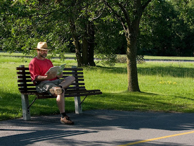
This was the case for some staged model shots and not wanting to bother using a friend or hiring someone, I decided to use myself in a setting. I hope its not like the lawyer thing were you have a fool for a client.

The outcome was not to have a great shot of myself but to have a reference image that I could use for oil paint as part of my learning process. I seem to be somewhat ok with landscapes but scenes with people really needs improvement.

The Process

I placed my camera on a tripod and pre-focused on the leading edge of the bottom edge of bench (to match plane of eyes) and then switched off autofocus. I set the aperture at f 10.0 for extra insurance for clear depth of focus and positioned the bench in the field of view for artistic merit.

The camera was then set (interval mode) to automatically take 10 images with duration of 10 sec between each shot. Then walk or run to the bench and pretend to look cool or some other silly pose.


What I learned

For static poses in a city type environment, a set of 10 with 10 sec between shots seems about right as random things do happen around you as the above image shows. Sometimes for the good but most times not that interesting.

If it were a dynamic scene, such as shooting hoops or jumping around, then I might try durations from 0.3 to 1 sec and a sequence of 30-40 images per session. Thank goodness for digital camera since development cost is only click and view.

Towards the end of this play time I noticed that the white pages of the book were reflecting brightly when angled a certain way and I used this to light the shadows of the face as in the first image.

Notice the comparison change in luminosity of red shirt and face by using book reflection in images below.

There is no reason that you could not also use a real reflector mounted on a stand for better light control.


The next few image shows a bunch of out-takes showing me running to bench, other people in scene, adjusting my hat and cars behind and a runner which works better in the second image in this article.


The image below is the early morning view from the bench looking across the Ottawa River. A nice spot even without a camera to just sit and think.


So if you are a novice like me with using live models then this method might work to get you some familiarity with posing, lighting and other techniques. Give it a try and share your experiences with the rest of us.

A few more images from around the bench with and without people.


Niels Henriksen

Like

Related Posts with Thumbnails