One of the big tourist attractions when you visit Denmark is to see LegoLand where it originally started. It’s on the same scale as the Taj Mahal or Petrus but it is one place that you should visit, especially if there are young kids or you have not quite left that mind set.
Legoland is all about colour and even these carts for parents to place their kids are brightly coloured.
While most of the day was spent with the family and the young kids running around looking at scale model of buildings, train rides and amusement activities, I thought I would also see if I could use my camera to render parts of the park interestingly. Reproduction of Nyhavn tourist harbour in Copenhagen, Denmark
 The lego trains ride around on the tracks and the old locomotives even exhausts steam.
 Under the water are tiny cables and the boats move on a course through the canals.
There are models of Fredensborg Castle were prince Fredrick Henriksen (hey that’s my name but no relation) lives with his wife Mary. The Danish royalty only use their first name and it was when prince Fredrick lived in USA that he was forced to take a last name. He chose Henriksen, an old historic Danish name.
A photo of the real castle is shown below, but at a more realistic street angle.
It’s not all about Denmark as throughout the park are many other models such as the Taj Mahal, Eiffel Tower, 4 US presidents and many others and of course, the NASA Space shuttle and launch pad.
Legoland is just not about the recreation of famous locations in Lego blocks. There are also marching bands and fun water events at least if you are standing and watching.
From the top of the rotating tower, there is a view of one of the Lego sets.
Thanks for viewing today and through all the year.
To all, whether just up-coming or recently past, have a festive and joyous Christmas, Hanukkah, Islamic New year Muharram and to all other events I may have missed.
Niels Henriksen
There will be no article next weekend but the following in the start of the New Year.
Sunday, December 21, 2008
The Original LegoLand – Denmark
Sunday, December 14, 2008
Printing Your Own Business Cards and Book Marks
Since this belongs to a Photography Blog, I feel that I should at least insert a few pretty ordinary pictures even if I am going to discuss printing your own business cards and bookmarks.
On Friday night the moon was at its closest distance to earth (4 hours after perigee) when it sis 14% bigger and 30% brighter at 5:00pm EST Dec 12. I had planned to be out at sunset to take images but got distracted with the constant cleaning up we are doing with some construction work that’s still ongoing. It was to take a week and now we are entering our 4th week of dust, dust and more dust.
When I went out to get the paper this morning, the moon was just starting to disappear over the western horizon and I remembered the perigee thing and grabbed my camera to capture a few images.
There were crows flying past the moon but not exactly where they are now. I combined 2 other images and placed the birds where I thought they would have good effect. Since the light was changing I used the curves tools and eyedropper to ensure that the blue around the birds where identical to the background. I set one control point to background and the other on the blue near bird. I then used a curve adjustment layer and tweaked individual the Red/Green/Blue channels to match the numbers on the background. The reason I did it with this method is that with the moving birds there is a bit of blur near edges and it is difficult to extract just the dark parts without picking up a bit of the background colour at the edges. This approach will give you a perfect match. The contrast of the moon was increased slightly. The sun is just striking the treetops and giving it a red glow. This was taken a few minutes earlier at a faster shutter speed.
Making Cards and Finding a Good Case
If you own Nikon equipment then there are these beautiful stainless steel cases made for Nikon eyeglasses that come with a cleaning cloth. They make perfect business card holders. These were given to me but I am sure that any higher end optical glass wear stores might give or sell them cheaply to you.
I am surprised that they don’t come with the purchase of a high end Nikon camera.
I use Photoshop to make and print my own business cards on semi-gloss photo paper, as I like the feel and look of these cards. The only problem is that I can’t print on the back.
I create a Photoshop layered file with several images and a different layer for the different fonts and word colours. I also create a thin black border that will form a cutting guide for each of the cards.
I then create a picture package under the automated command and create a template that reduces each photo to a 2.5” x 3” card and places 8 cards on an 8x10” sheet. The master file has several images that I use so I can create various versions. See image below where I have combined them.
I use a sharp drywall utility knife and a metal edged ruler to cut out each card along the black lines. This is a bit labour intensive but I do like the quality of each card.
Now the Shameless part
Whenever I am in a magazine store reading photography magazines and I notice another person who seems interested in photography, I ask them if they read photography blogs and if the conversation continues I will ask them if they want a card to my site and if nothing else it makes a good book mark.
Yesterday I was in a multi-goods store and there were some people looking at cameras. I spoke to them to see if they need any help with camera selection and afterwards handed out one of my cards.
I never hand these out without having some dialogue with the person and I also determine first if they are interested in reading Photography blogs.
Larger Bookmarks
I also print vivid landscapes and cut them into strips and laminate them, yellow represents the clear plastic, and I hand these out to friends as 8” long bookmarks.
Easy to make Christmas or any type of gift for people whom like to read books. These have no advertising on them.
Niels Henriksen
Sunday, December 7, 2008
Nykobing Mors Panoramas
As part of my 8GB walk-about which I discussed in the last 2 articles (see realted links at end) I also decided to take some extra wide panoramic images. Having a small body of water between you and a landscape or cityscape makes it easy to get some long panos without having obstructions blocking your view.
The first image is 50,169 pixels wide by 3381 high and is comprised of 24 images. I used Autopano Pro to create the final jpeg. It does such a wonderful job of determining which parts to blend together and even straightening a few slightly tilted horizons.
For some reason Photoshop would not open the jpeg directly without giving a parsing error, but loaded fine when opened in ACR first. Go figure.
 I made this reduced jpeg 2400 pixels wide so you can see better details when you click on this thumbnail
 If printed, the above image would measure 209” by 14” or (approx 17 ft by 1 ft)
The image was shot without a tripod and that is why you can see a slight difference between some of the frames that made up the composite.
Photoshop is not Panoshop
After working with the panos in this article I have come to realize that Photoshop is not great with large panoramic files. It became excruciatingly painful to produce these smaller jpegs, with many crashes of Photoshop. I may not have the last PC but at 2.4Ghz CPU and 2GB of memory it took 7 minutes just to load the full jpeg image (66MB). It would crash when I cropped small sections and also would crash when I tried to save these smaller panos. I used a few tricks like cropping in small increments to finally get Photoshop to work.
 This is a close section of the harbour that is about 1/3 from the right and the image below is about ½ actual pixel size from the centre of the image above.
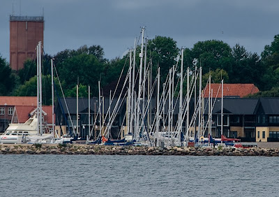 There is just something magical when I look at the full detail in the uncompressed version. It’s just like being there again with binoculars.
If Photoshop had problems just handling the final jpeg I am not sure how well it would handle the 24 RAW images and layers to make the composite. I don’t think I will even try.
Even Autopano Pro took 1 hour to render and compile the final jpeg pano. I now think that I may have taken on too much of a task.
The map below shows the area covered by the 2 panos, the red colour for the pano above and the yellow for the next pano. The blue + is where I stood to take the images and was a perfect spot for 180 degree of rotation.
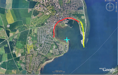 I was trying to get a B&W pano that my nephew could hang in his living room. I didn’t find any sections from the first pano that seemed to work graphically enough.
The 2nd Pano (yellow line above is 30,350 by 3,139 pixels in size. I reduced it from the original 40K pixels width, because of the problems I was having with Photoshop handling the larger jpeg as I removed some of the treed shoreline on the left.
I did mange to find an interesting section that might work as a pano image with a bit more contrast built into the clouds.
Close-up section from image above.
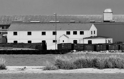 These are fun and I would love to have them printed full size but with the limitations of computing power I now need to rethink my approach to panos and make them more reasonable in size for file handling.
In a previous article “ Shoot Wide Very Wide Panos Images ” where I show some more reasonable panos images that could be printed and framed.
A few more image from the point.
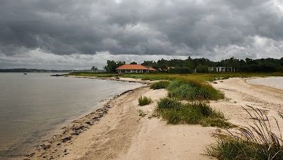
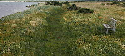
A pathway leading to the point on the top left.
Niels Henriksen
Related Articles
My 8GB Walk-about
8GB Walk-about Part II
Monday, November 24, 2008
8GB Walk-about- Part II
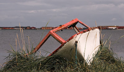 Sharpening and colour enhancement to red part of boat and a little de-sat and darkening of grass.
Setting a goal for the number of images I wanted to take and for this photo walk, which was almost 500 photos, wound up giving me more ‘sense of freedom’ in my approach to photography.
It didn’t start out that way. I was on a family holiday and every now and then I needed to be out by myself, seeing what I could discover and create ‘anew’ with the camera.
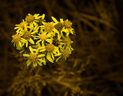 Background masked with B&W adjustment layer. Curves applied only to this part to lighten lighter parts of background. New layer set to color mode with a light brown fill and masked for background. Some darkening and highlighting applied on background.
It wasn’t until I had taken a few images that I realized it was now somewhat easier to take photos and I was having a little more fun. Usually, when I am out taking photos I am trying to find that great shot. If something seems interesting I
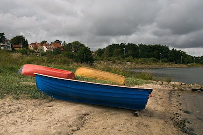 New RAW layer added as smart object and boat colours adjusted on the luminance and saturation sliders and then masked in.
 I found that by setting a ridiculous, at least for me, high number of images to be taken, that there were some benefits that were obtained.
- More relaxed approach to taking photos.
- More depth in exploring the locale. Knowing you need a lot of images you tend to look in more corners and alleyways, etc.
- It breaks some of your old habits or routines, as there just isn’t the time or energy to tackle the subject matter in the tried and true methods you normally use.
- Changes your approach to creativity as you need to analyze less and just shoot what catches your eye or emotion.
This is not guaranteed to make big changes in your style but it may open up new approaches you hadn’t as yet tried. Also depending on your own style you may already be using this method.
I do find that it is fun to try new techniques or styles with my camera. They are not always completely successful, but I do learn from them and there are always, even if just 1 or 2 that I am pleased with.
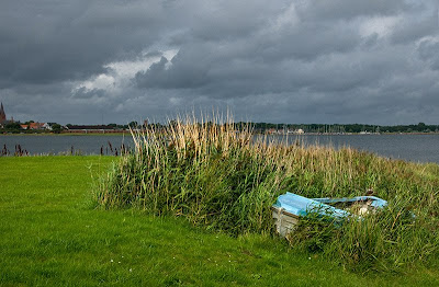 New RAW layer added as smart object and boat colour adjusted reduce brightness and increase sat
The landscape did lend itself to taking panoramic images and that sure also helps with the shear quantity I need. I always seem to find something magical about large panoramic landscape images. There is a sense that you almost walk into them. That lovely rich detail that encompasses your vision.
I will show some of these in next weeks article.
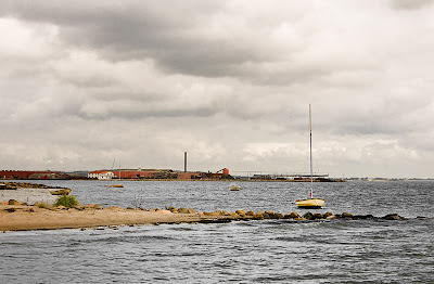 One RAW layer to keep water slightly blue and increase brightness of spit. Another raw layer added to increase contrast of the sky and make neutral in color.
Niels Henriksen
To see part I of article My 8GB Walk-about
Monday, November 17, 2008
My 8GB Walk-about
That’s correct, the distance is measured in giga bytes, not miles or kilometres even though I walked for a 4-hour period. It is measured by the amount of memory that is loaded in the camera. 
One windy but dry afternoon, things were quiet at my sisters’ place in Denmark and I decided to head out along the shoreline of Nykobing Mors. This city is located on an island, which is surrounded by a sea and all of this is located within the mainland peninsula of Jutland. On the southern part of the bay, see map below, the shoreline being mostly sand, is easily accessible and there are large tracks of treed and wild grass sections to roam about without being crowded by residential housing.  The yellow shows the route I travelled. At one point there was little room at the shore edge so I headed inwards for a bit and came back another route.
On a previous excursion further south I took the photo below and I knew that I wanted to explore this area towards the city. 
As part of my walk-about I had predetermined that I was going to use up the entire 8GB of memory card, which to some of you would seem extreme but with 18MB per RAW file (D300), which is about 450 pictures. Still a good number.
With the short distance (3-5 km) to opposite shoreline across the sea, there would be good opportunities to get several long panoramic images, as my nephew had requested a B&W for his living room wall.
It always amazes me that when you are in a new location, how many photographic images seem to jump out at you from ever nook and cranny. Yet when I am in my home environment with similar settings (Ottawa has a river with rocky shoreline) it can seem ho-hum. There are finds but not at the same intensity. It must be the sense of adventure and the unknown that jump starts those creative juices and makes all things a wonderful discovery. Even when they might appear mundane to the locals.  The above image was darkened and de-saturated along the outer edges to dramatize the effect of a tunnel created by the trees and the path to water’s edge.
I wonder how many others walk through here and have the same sense of this place and can see it the way I see it.
I am breaking this series into 2 parts to show some of the different finds along the route and a 3rd article will just be about the panoramas. Originally I had done this in colour. The red boat was set amongst the red-brown of the tall swamp grass and I emphasized the red and orange saturation and luminance. I find that the strong wind movement shows up in the better B&W version. I’ll show this colour at another time.
It is not hard to have fun when you have dramatic skies (underexposed a half a stop) like these and you are also outdoors doing landscapes.
There is a certain freedom to be gained, especially from your own judgement, when you know that during a certain period of time you must obtain a large number of images. There is just not enough time to second-guess yourself. Shoot what pleases the eye and you will be amazed at some of the good images you have in the collection.
Niels Henriksen
Sunday, November 9, 2008
Crazy Hot Air Balloon
The other night just after the sun had set I looked out the large kitchen window, which gazes upon the Ottawa city green belt (natural tracks of land within the city boundaries), and the whole sky at first was a brilliant flaming RED.
It took a second or 2 to realize that a hot air balloon was just about to land a few hundred feet past my backyard.
I quickly screamed out to my wife “Look, Look” as I ran downstairs to grab my camera.
I ripped open my bag and as I race up I am already adjusting the iso to about 1,000 as it is already dusk and I knew there was not enough light to hand hold at slower iso.
I run out the back door and and take a few clicks as I am trying to get through the hedge. From the shutter sound I already know that this iso is not fast enough. Quickly crank it up to 6400 as I want to get a few shots as they are still applying the flame to turn the balloon for a proper deflate.
Don’t ask me why I am not checking the shutter speed in the viewfinder but I guess panic takes over for common sense.
It is then I realize I am still in my stocking feet on the cold wet ground. Thank goodness that I have a vibration reduction lens because at that focal length and crop factor I should be shooting faster than 1/250 sec.
I went back inside to put some shoes on and as I am heading out again they are starting to deflate the balloon. I use a wider lens settings which gives me more light and I can now drop the iso 3200 for better noise control
The above shot I do manage to hand hold down to 1/8 sec and still remain sharp. But there were a few images which were quite blurry. The interesting thing about cameras is that for the second shot it is actually darker outside, but because of the longer shutter duration it appears a lot brighter than the first image. This is almost night photography as the first image actually represents the real darkness I saw, while I was taking these images.
Are there images of you as a Photographer?
One thing about photographers is that we do tend to have a lot of images but very few if any of ourselves.
During an Ottawa Camera club outing which I had organized late one cold November one of the members took an image of me taking a photo.
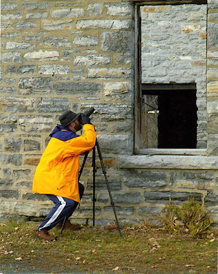
This is an old abandoned building and through the window above you can see one of the inner walls and a doorway, which makes the open window seem strange.
The object of my desire or attention is shown below.
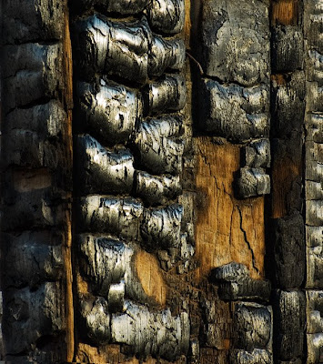
The window frame was burnt and I love the textures and patterns created by the charred wood and the bright cloudy sky adding highlights to the edges.
Niels Henriksen
Friday, November 7, 2008
Kreativ Blogger Award
The other day I received the Kreativ Blogger award. While not the same as a Nobel prize, it is non the less very rewarding to be recognized by another blogger for the effort in sharing and fostering community involvement to one’s craft.

Anita Jesse on her blog Through my Lens made the announcement that 5 bloggers and myself deserve this internet blog award.
I am very honoured to have received it.
I really enjoy visiting Anita blog for the peace of mind, if this makes any sense. Her photos have a quality that for me, has a feeling of taking me home. These are images of her surrounding that convey a gentle place. A place to be able to sit and ponder. As an added benefit there is her writing style, as she openly discusses this place and lately the transition to her new location, which brings that comfort as we may also be wondering about our lives.
Do visit the site and spend some time there.
This being a photography blog I felt I had to add at least add one pretty photo. Taken with a cannon A30 - 2mp P&S camera
I am not sure where this blogger recognition event started, but I think it is a great thing as we should all on a continuous basis take the time to thank all the bloggers, whether in our particular niche or in other areas for the effort and more importantly the way bloggers bring people together who have a particular passion.
The Kreativ award is a bit like a chain letter where bloggers who receive this award take the time to send the same award to 6 bloggers who deserve the recognition. The hard part is only limiting it to six.
The great thing I find about blogging, while for some it is business driven; they all bring a personal face and their passions to what they love.
As a side note when receiving this ward the recipient should also list 6 thinks they like.
There are several other fine Bloggers that are already in my side list of favourite bloggers who have also received this ward and therefore I thought I would try and highlight great bloggers who were not already recipients.
Brain Auer at Epic Edits is one of those people who not only takes great photos but has dedicated himself to helping out many other aspiring photographers. He has built a great community of users because of his passion for photography and drive to help others learn.
While I am not a professional photographer and I am not sure that I could really handle all the stress, John Harrington at Photo Business News and Forum sure understands the business of Professional Photography.
He has written books on the subject and in his blog articles shares willing how to really be a professional and this means correct business sense, not just a wiz kid with a camera. Even if you don’t plan to be a professional his sound wisdom will help you in other parts of your life be successful in dealing with people.
As a blogger it is good to understand general best practices about blogging and for some like me to understand the code behind blogging platforms. Blogging Tips is a site that covers both these issues very well.
Chris Brogan is a blogger that focuses on the organizational and business aspects of using social networks to collaborate, share knowledge and built relationships in this ever changing work-life thing. Even if you are just blogging for yourself is good to understand how we are interacting within our societies.
As photographers, and I think that is why you are mainly here, it is good to examine other art mediums. This will help you see or want to explore new artistic avenues. I therefore read several painting blogs just for the visual pleasure and the occasional new idea.
One site I enjoy is Different Stokes form Different Folks by Karin Jurick.
He takes a photograph and then does is own painting and then requests others to submit their interpretations of the subject. It is great to see so many different views.
I also enjoy the Daily Paintings by Justin Clayton and these should give good ideas for your own photographic subject.
The Six things I like. It could as easily be six dozen or 6 hundred. There are so many simple things to like in life.
I like the mornings when the sun rises and brings life and light onto the world.
I like moving water, whether an ocean, river or falling rain.
I like how new camera technology has helped me focus more on my subjects and less on getting the camera settings right. (but sometimes I still screw up)
I like the song ‘Somewhere over the Rainbow’ sung by Israel Kamakawiwo'ole
I like riding a bicycle
I like storms, especially when I am safe.
Thanks for reading and do take the time to thanks the bloggers who you read for the effort and passion.
Niels Henriksen
Monday, November 3, 2008
Triptych Plus 1, a 4 Photo Vertical Picture
The number 3 is one of the major standards for composition and design elements. In many photographs, 3 similar items will form a triangle when connecting the objects together and this is used to keep the viewer’s gaze moving around the photograph as we go from one item to the next.
In fact there is even a special name for a 3-image photograph or 3-panel painting which is a triptych. But what is when you want to include 4 items as in my 4-image frame below?
 The above image framed would be about 5 feet tall and 20 in wide.
On the Canadian Thanksgiving weekend when I took the images for the article The Many Colours of Fall I also took the images used to form the picture frame above.
After I took the image of the 2 people silhouetted against the bright fall foliage I turned sideways and saw this old dead tree, which formed a transition between the green pine trees and the vibrant foliage on the rock face. I did not have any special idea at that time. I only knew that the textures of the dead tree and colours looked great and I decided to take 4 images as I moved from the pond reflection upwards.
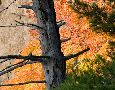
This is a close-up section of the 2nd from the top panel to show the great detail in the dead tree.
Each image I composed was a stand-alone image as I figured that one of these would probably turn out to be a real keeper.
It wasn’t until I got home that I realized that combined together, they just might form an interesting multi-image photograph. When combined together in a vertical pattern set the trees do not line up in a standard tree pattern.
The location is more than 100 miles away and with fall foliage just one day can make a great difference in the landscape, let alone the lighting conditions. There was just no way to go back and re-shoot.
There is some advantage in not having perfect alignment as it does compel the viewer to spend a little longer on each image as they move up or down. It also, for a brief moment, causes the viewer to wonder if each image is from the same spot.
This may be a good thing, as they might spend a little longer time viewing and thereby pondering what meaning you are trying to convey, if any.
But I would like the option to see how other alignments work, without having, in my case, to crop the format.
I did try a 4 Horizontal arrangement as shown below.
 Then a 3 image horizontal arrangement.
With the set of images I prefer the 3 set better for the horizontal version.
I will print and mat the 4 vertical set and see how this looks before I get a frame made. Sometimes the only way to really understand a photograph is to print and then give yourself time to contemplate the result.
Niels Henriksen
Monday, October 27, 2008
Heddal Church Norway - D300 at ISO 6400
The completely wooden Heddal Stave church just outside Notodden Norway gave a good opportunity to test out the capabilities of the D300 at iso 6400. I did bring my tripod with me but for the many day excursions it was a lot easier to just attach the Nikon 18-200mm vr lens and increase the iso to compensate for low light situations.
These Stave churches were built from the early 11th century to the 15th century. At one time there were approximately 800 to 1,000 of these churches built and now only 25 remain. Since these are built entirely of wood many were easily destroyed by fire.
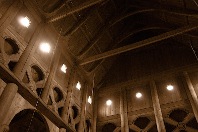
Being all wood it was easy to limit the colour noise by de-saturating the colour a bit and then adding a light reddish brown layer set to colour to bring out the warm tones. In Adobe Raw I did set the colour and noise to almost max settings.
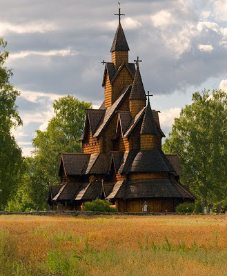
This is the Heddal church, built in the12trh century, is a triple stave church and is now the largest remaining church.
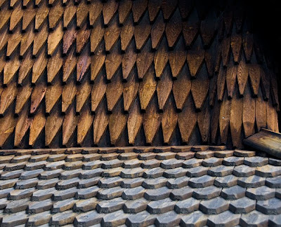
Close-up view of the outside hand cut shingles covering all the roof and wall sections.
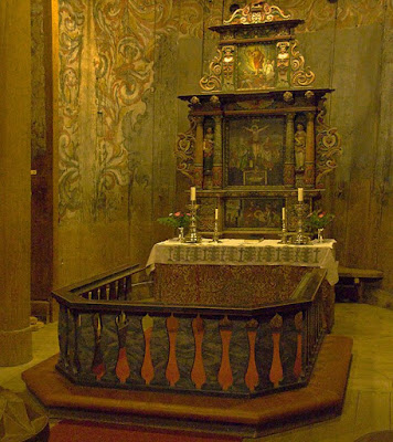
The above image is of the altar, which is mostly lit by candles and the top window light does not reach into the altar enclave.
In the image above you can see the rose painting covering the inside walls. This painting covers some of the more Norse Viking type scenes that originally decorated the walls. It was repainted with the new abstract patterns as the Viking images became out of favour and the Christian teachings and Viking mythology slowly disappeared.
You will notice how the WB has changed from the walls at top being lit by outside light and the post at bottom being lit by candles and therefore a redder tone.
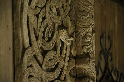
Around the bottom of the church is a corridor that runs around the whole of the chapel and there are different doors to go in. This is part of the carvings that surround these giant 10 foot doors.
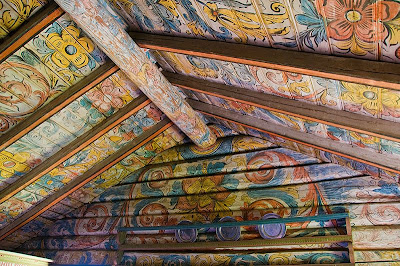
Near the church is a site where they have moved several log cabins as an historic site. You can see the brightly lit rose painting or rosemailing. This is the same as in the church but here we have many windows that provide more light into the interior.
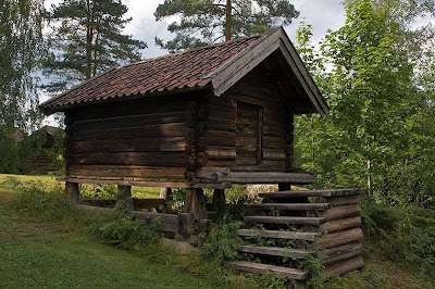
This is a shed on the site but the larger log cabins are built the same method.
You will notice that the log cabin sits on stills and then there is a log split in half and with a flat side on the bottom. This is to prevent rodents from getting into the houses. Note how the steps do not attach to the building, which also keeps them out.
The D300 does a good job of image capture at the higher iso setting of 1600, 3200, and 6400. They are nosier than lower settings but still produce great shots. If you shoot with film and I think the highest was 3200 B&W, these shots would normally not be possible and if you did have very fast film the grain would be very pronounced. I do like the B&W film grain better as the luminance speckles were more random in size and tended to produce better patterns.
You do need to use the luminance and colour noise reduction to improve it. The use of sharpening is not recommended, as it will enhance the noise.
The best method is still to use a tripod and go for longer exposure, but when not possible having an image stabilized lens and high iso, you now are able to get very reasonable images that would not be normally possible.
Niels Henriksen


